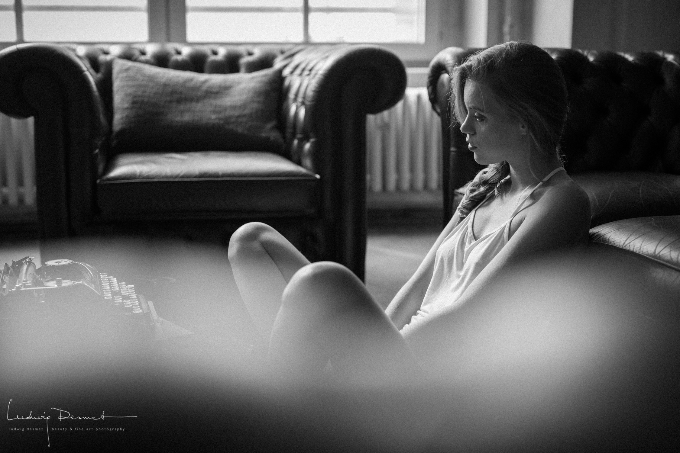
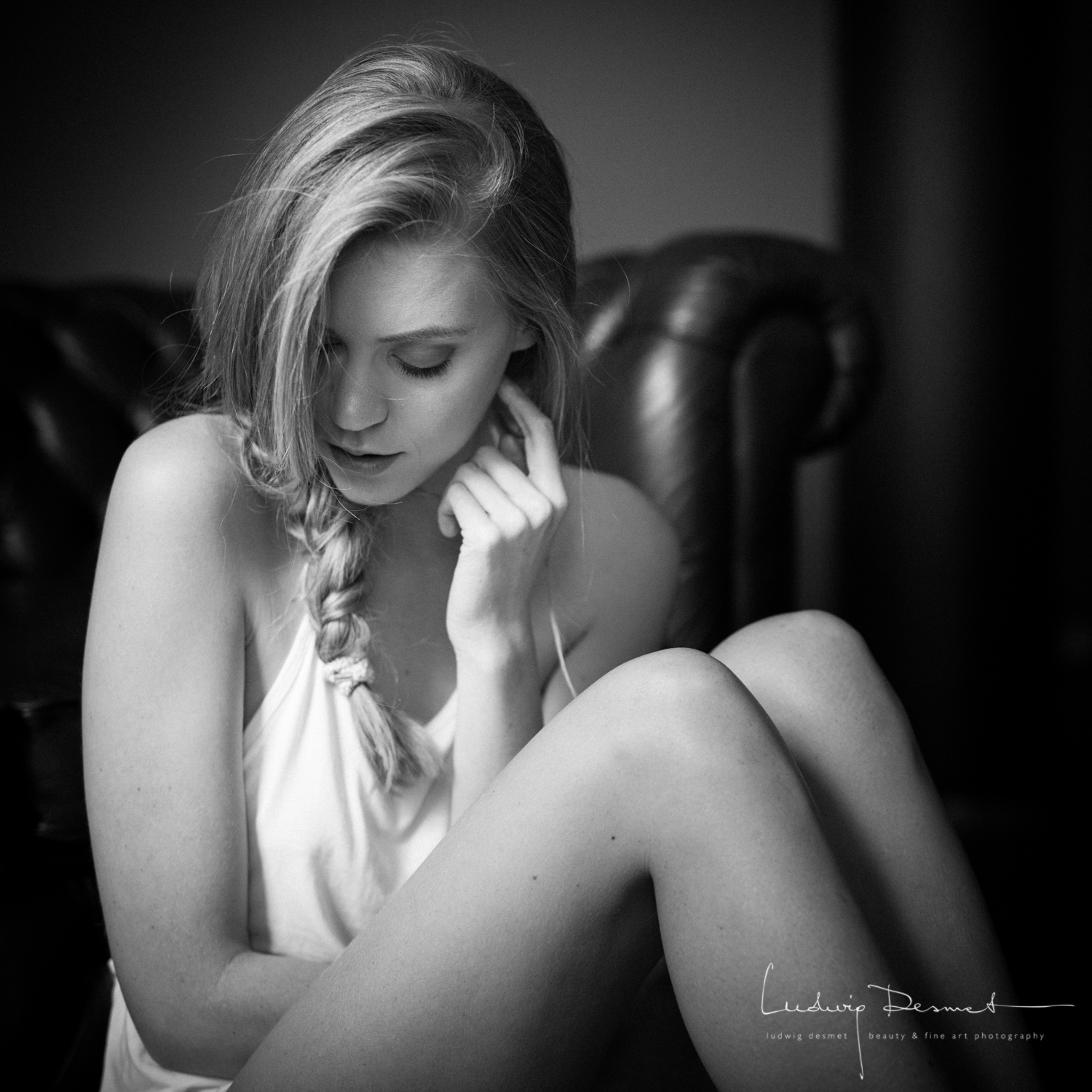
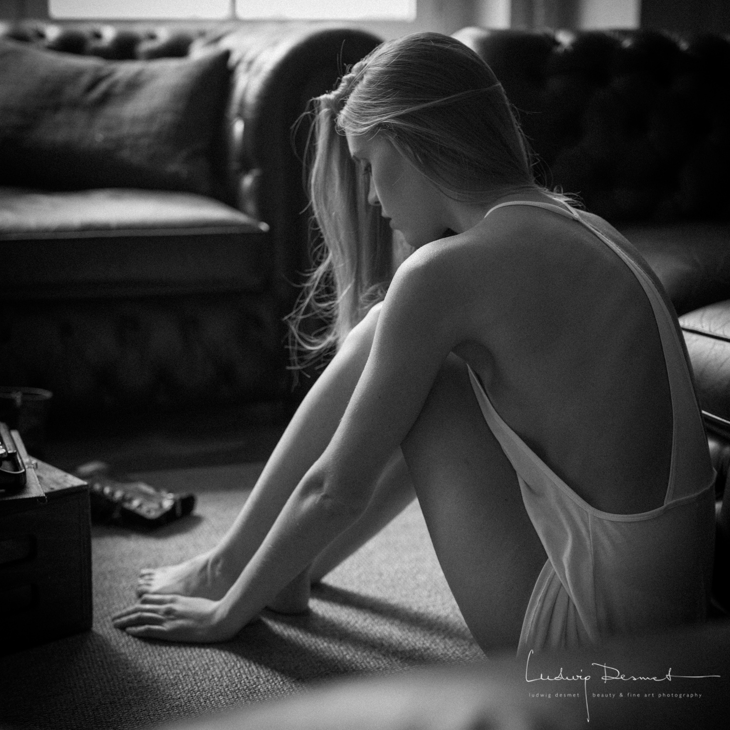
alternative beauty – Alopecia

beauty, Nude, portrait

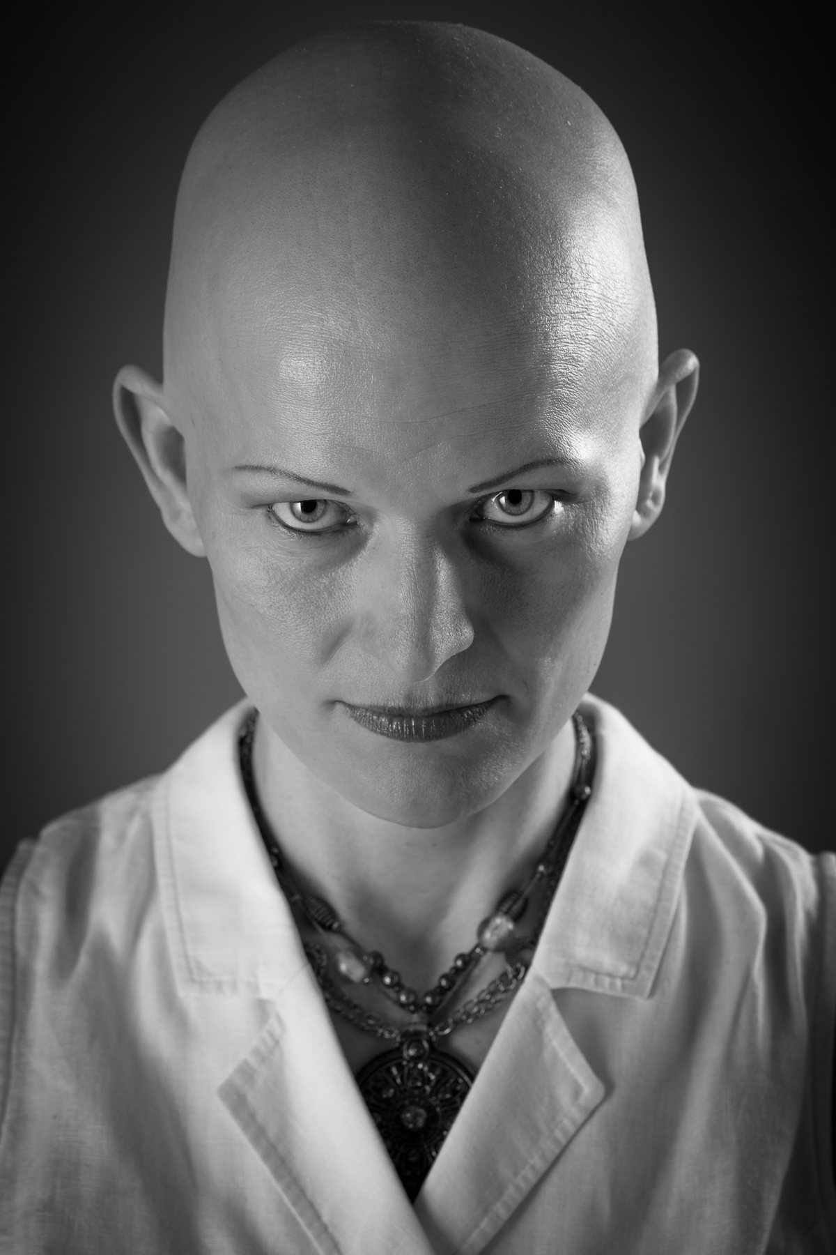
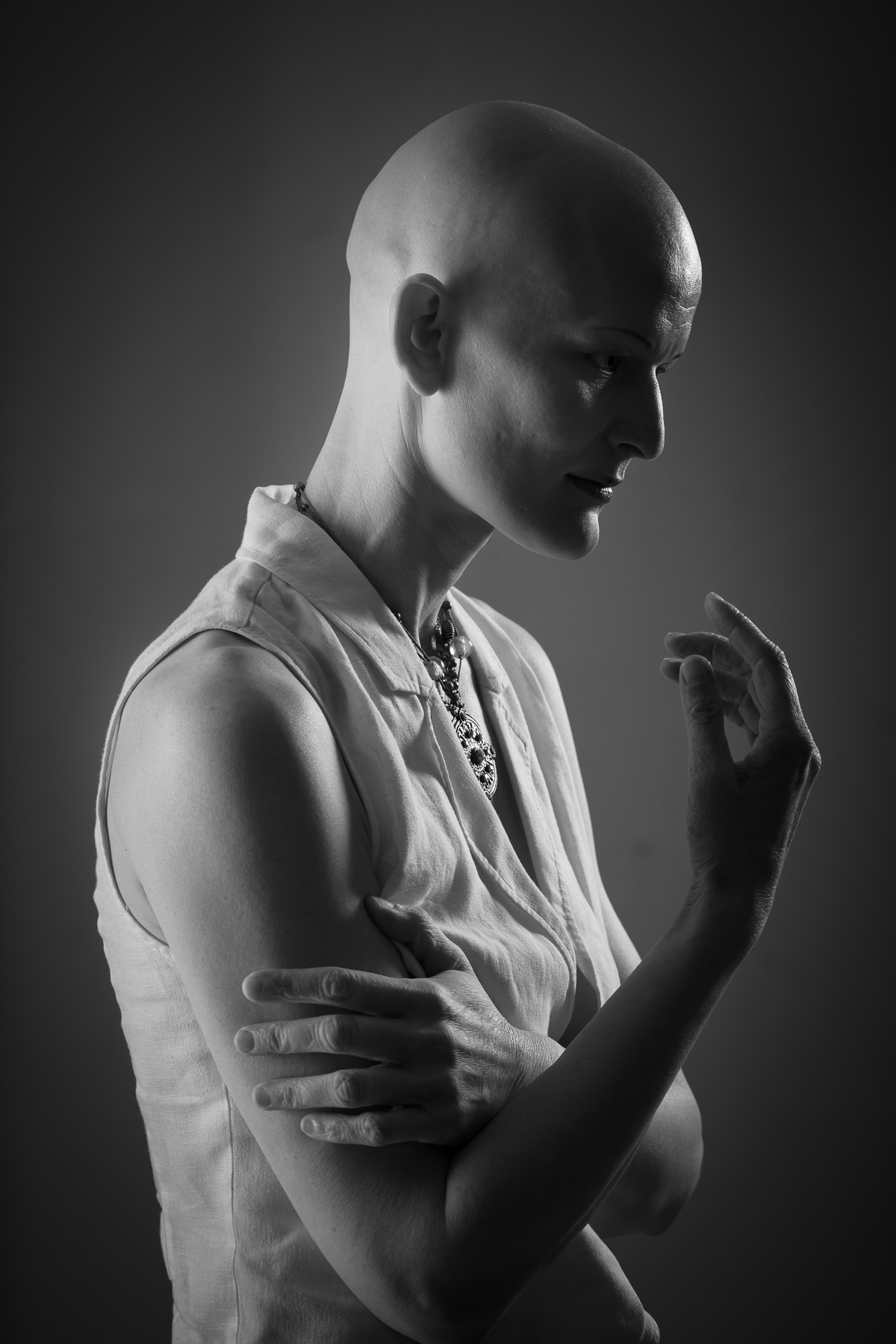
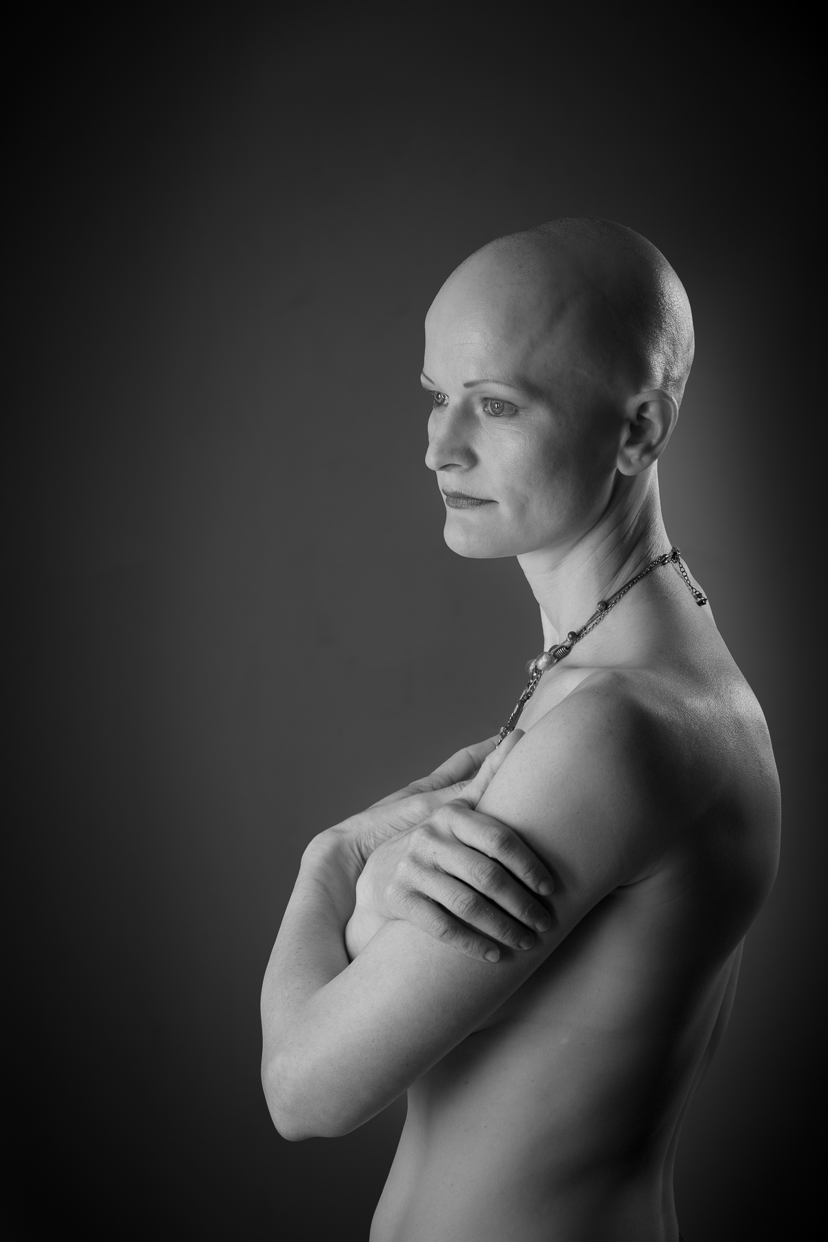
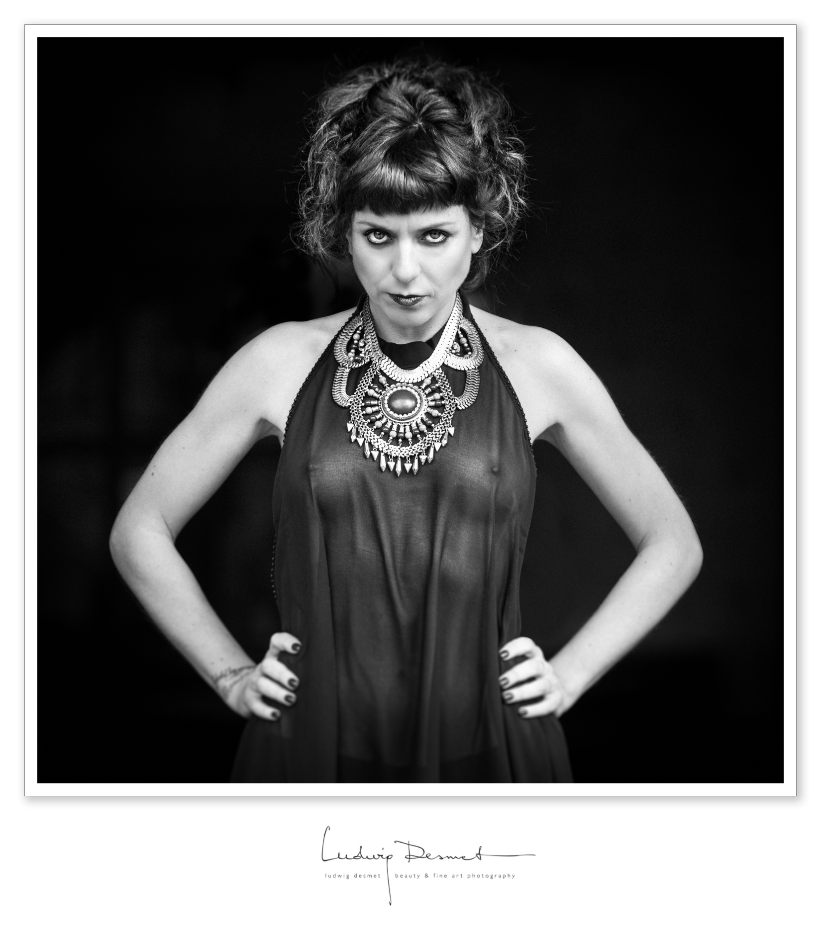
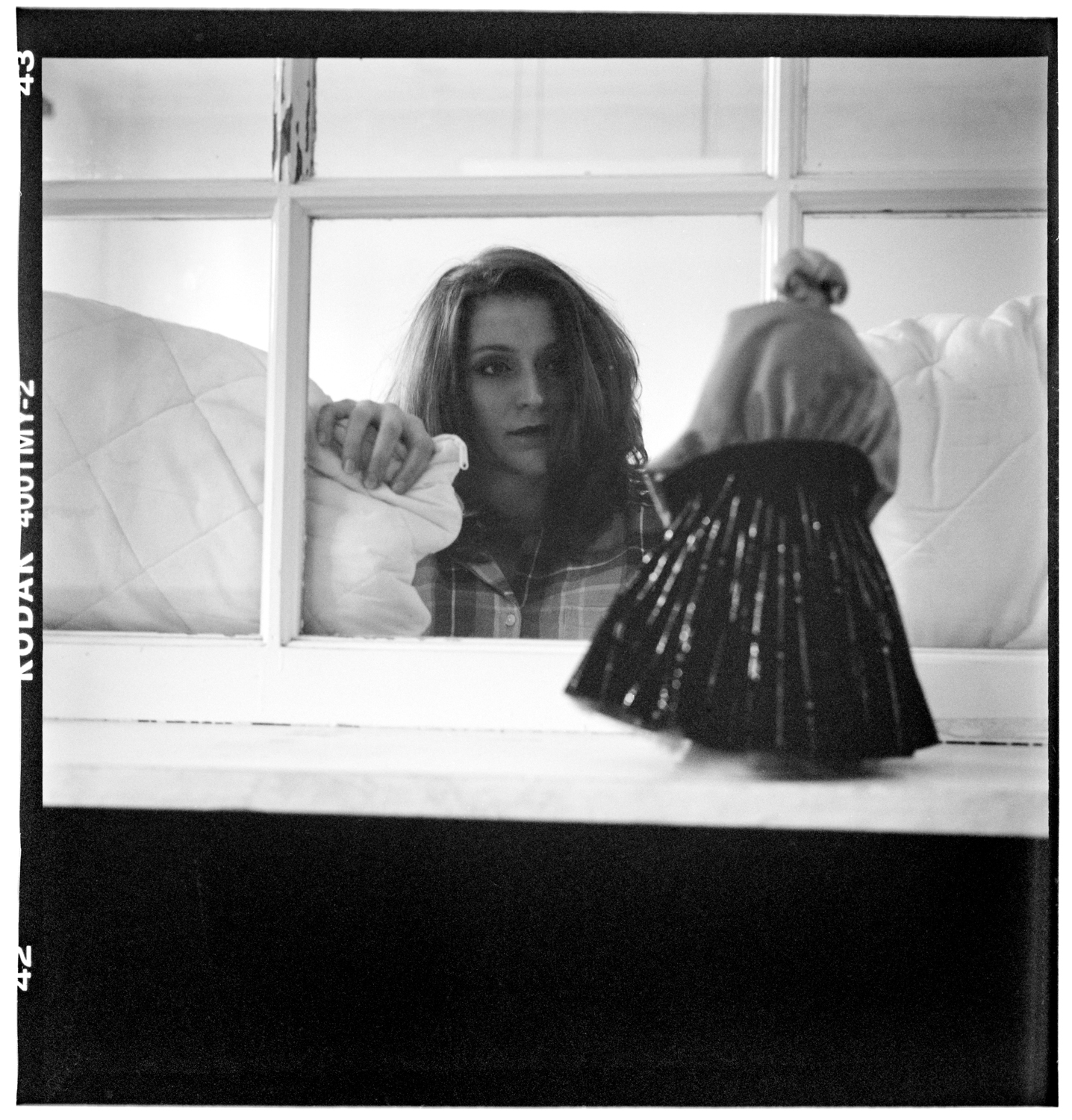
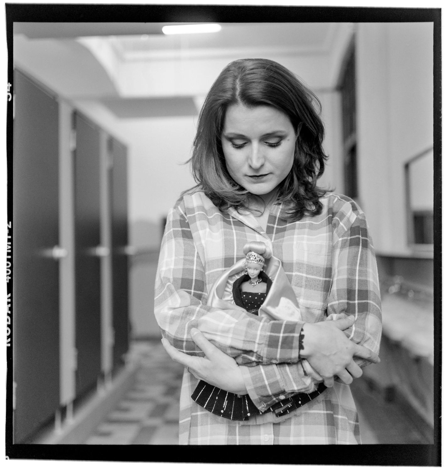
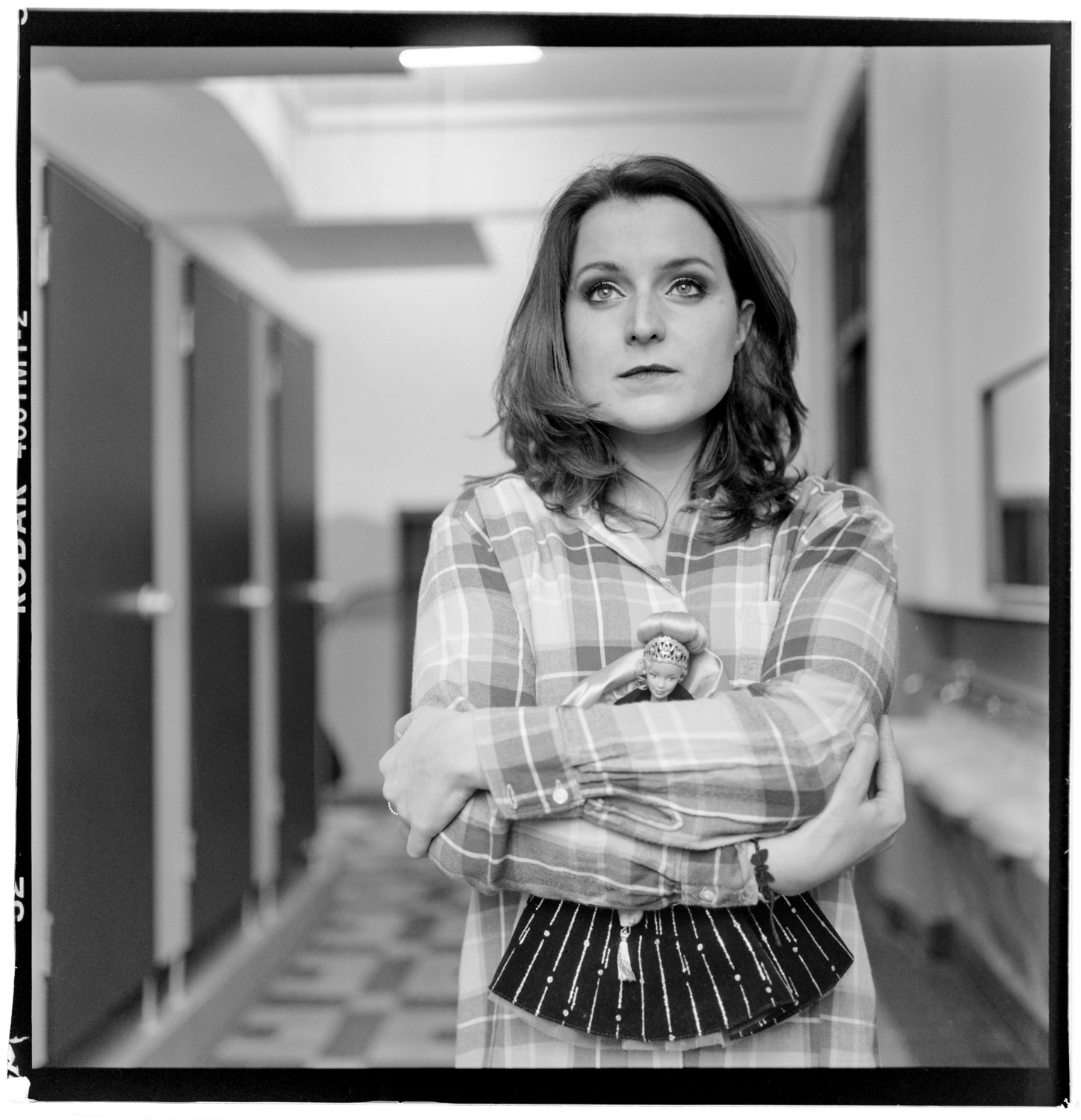
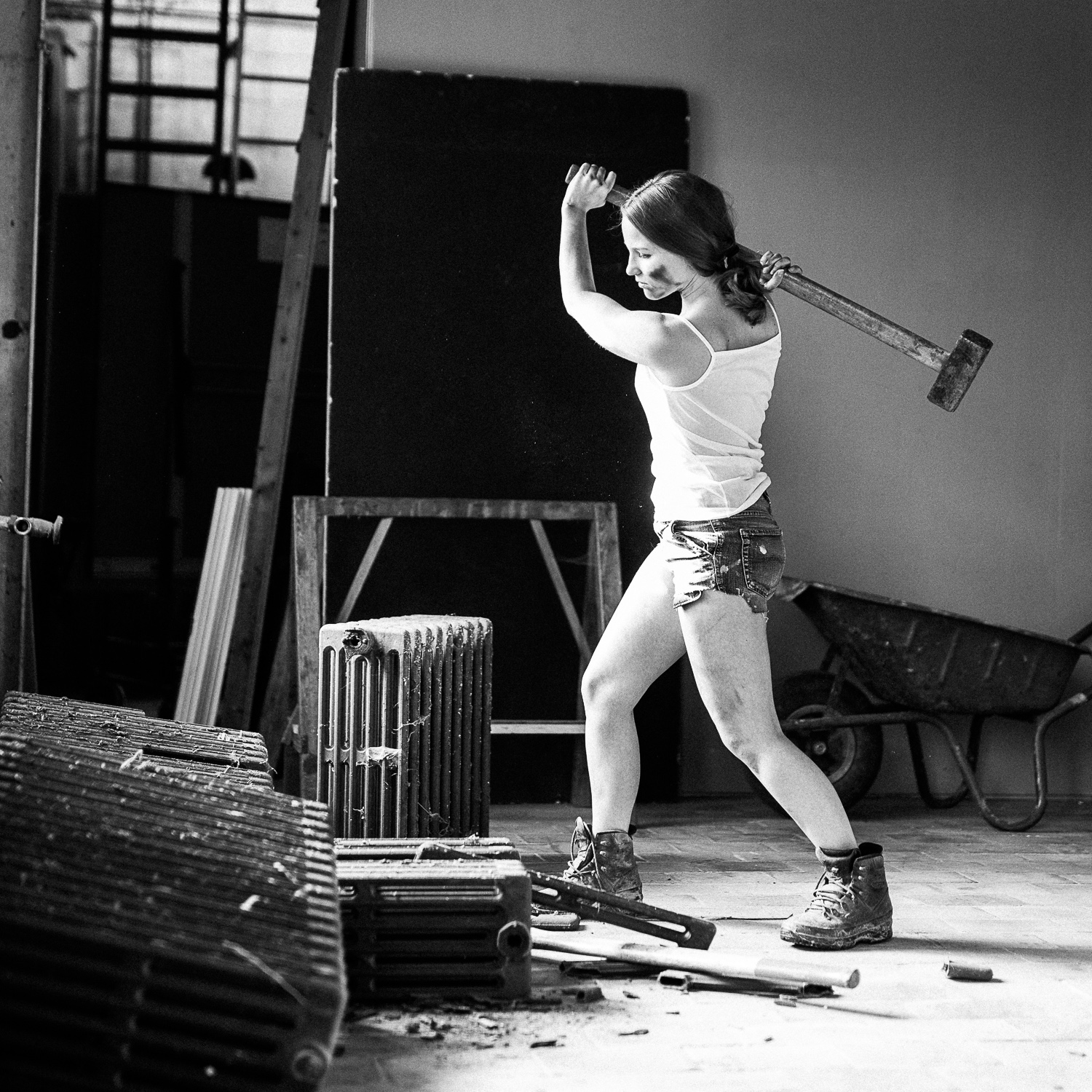
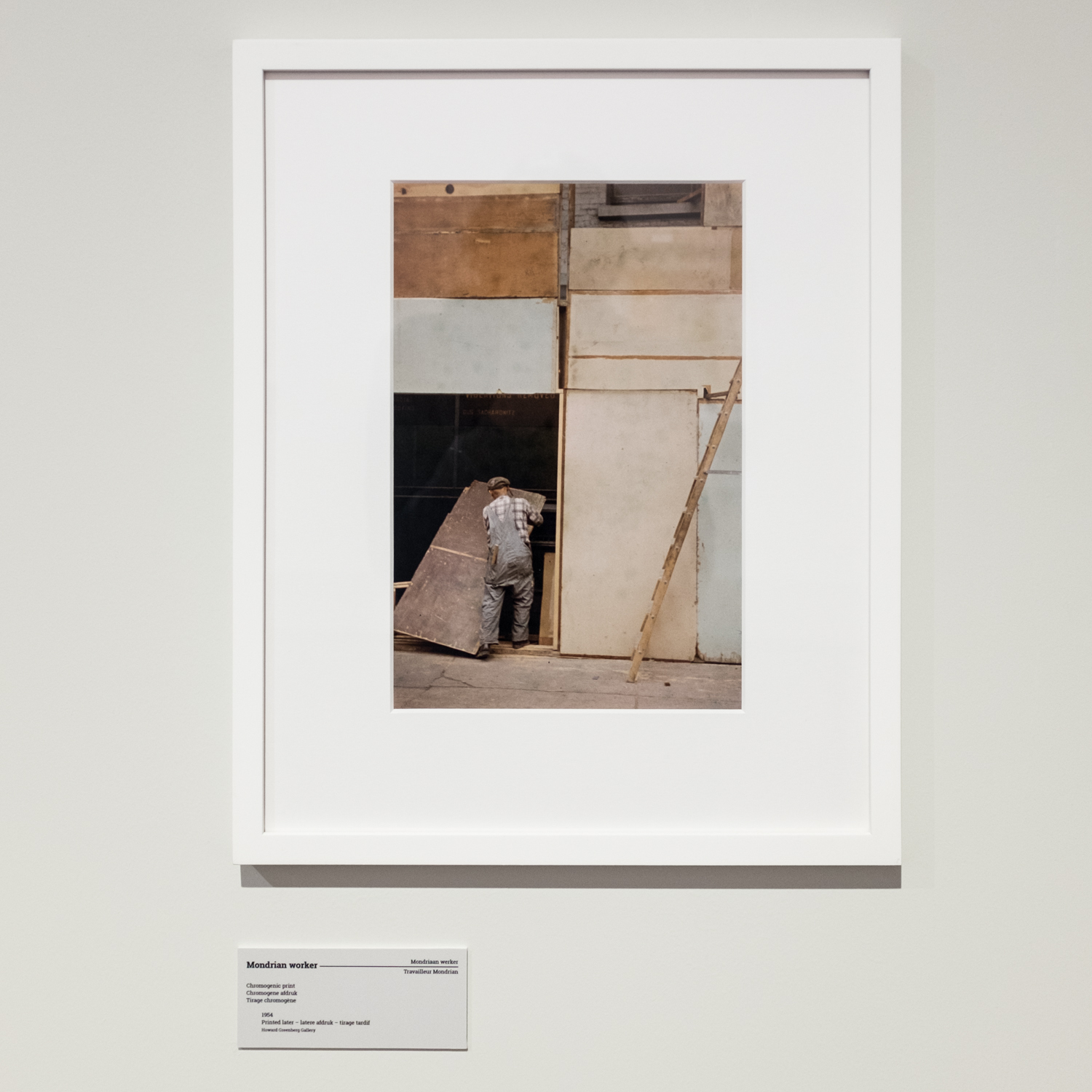
We met at my last exhibit in Ronse. She’s not trying to hide her baldness, and wears it with pride. We agreed on a cooperation, she loved the pictures.

Alopecia is a disease that results in partial or total hair loss, for Marlies it is total.

Make up: Heidi

Model: Marlies

Shot in my atelier in Ronse/Belgium. It has been a long time since I used my studio flashes. This was the first time in my re-organized studio space.


A photoshoot for your own, please contact me at ludwig -at- ludwigdesmet -dot- com


all images shot on Canon 5Ds, with Canon 100mm f2.8 L IS Macro

thank you for watching, please come again soon, there’s a lot to publish, with landscape images from Scotland, Corsica, some more beauty shoots etcetera, …

Ludwig

Lady Madonna – I think I made a new fine image

beauty, location, Nude

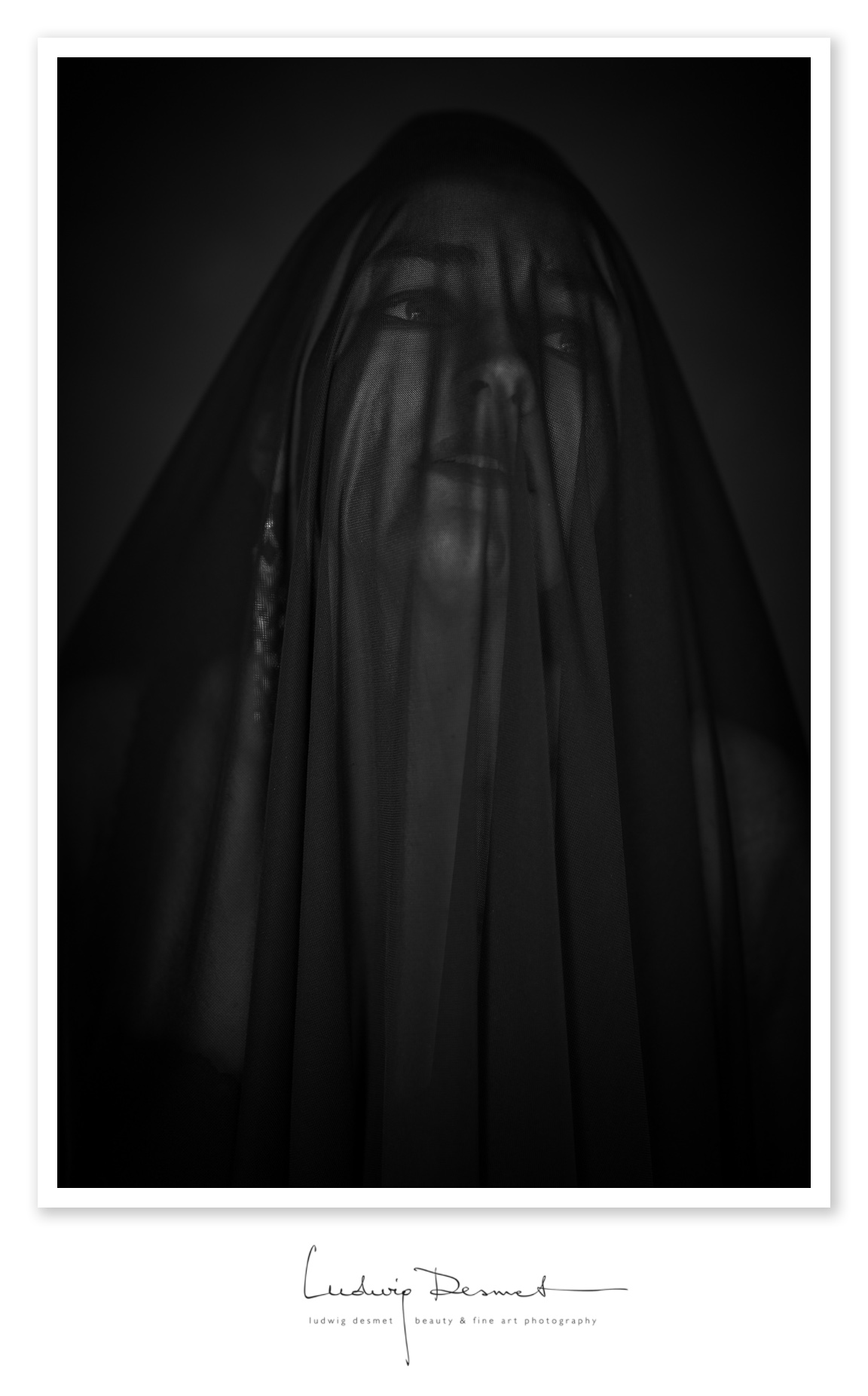
• Lady Madonna •

shot today in a remote castle in Tournai, Belgium,

lots of thanks to the owner of the place, and to my model of course.

sometimes all falls into place and beauty is the result of it.


Model and make up: Eva Evian

styling and photography: Ludwig Desmet

shot on Canon 5Ds with Canon 135mm f2 – ISO 200 f2.8 1/250s

thank you for watching,

Ludwig

Strolling trough Paris part II – shooting with the Rolleiflex

Analog, street

this is from a while ago.

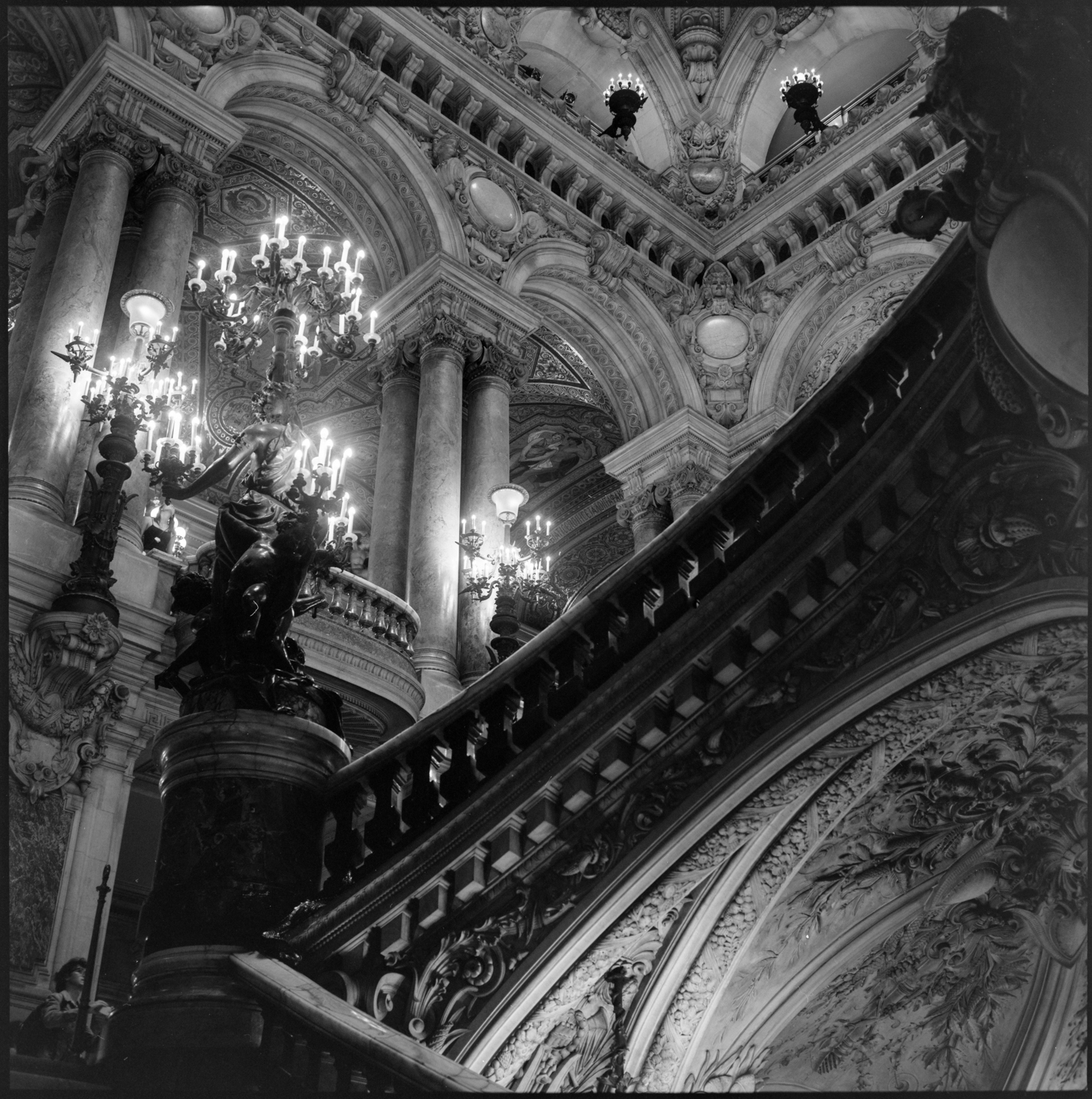
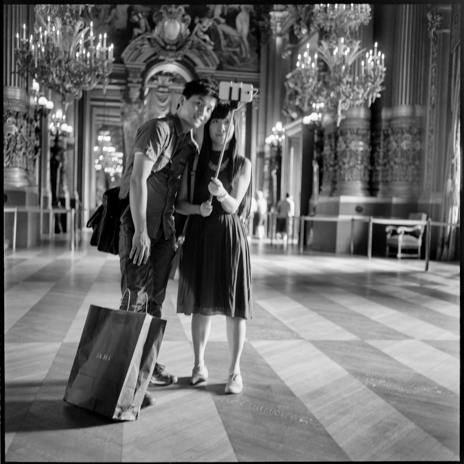
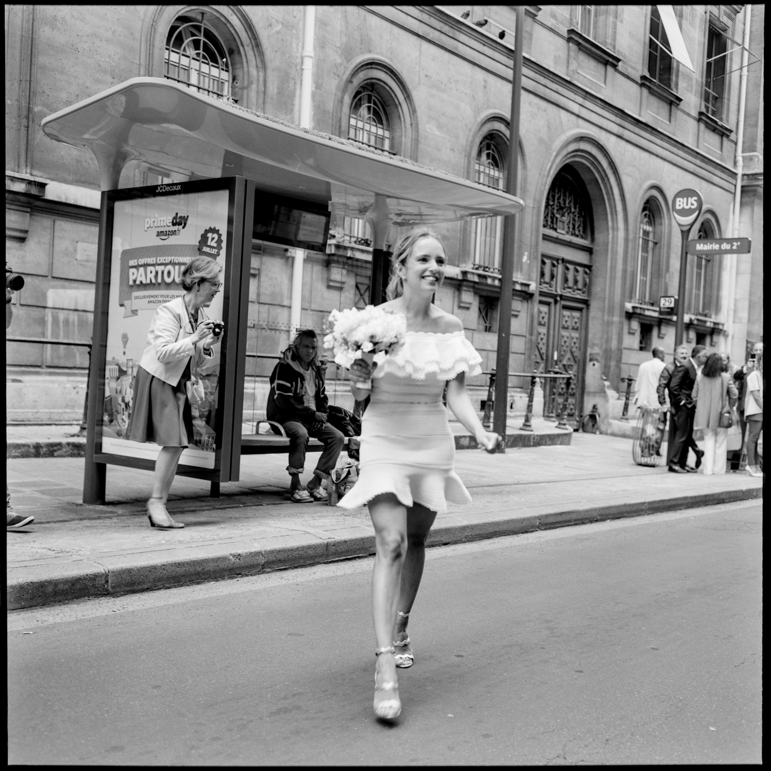
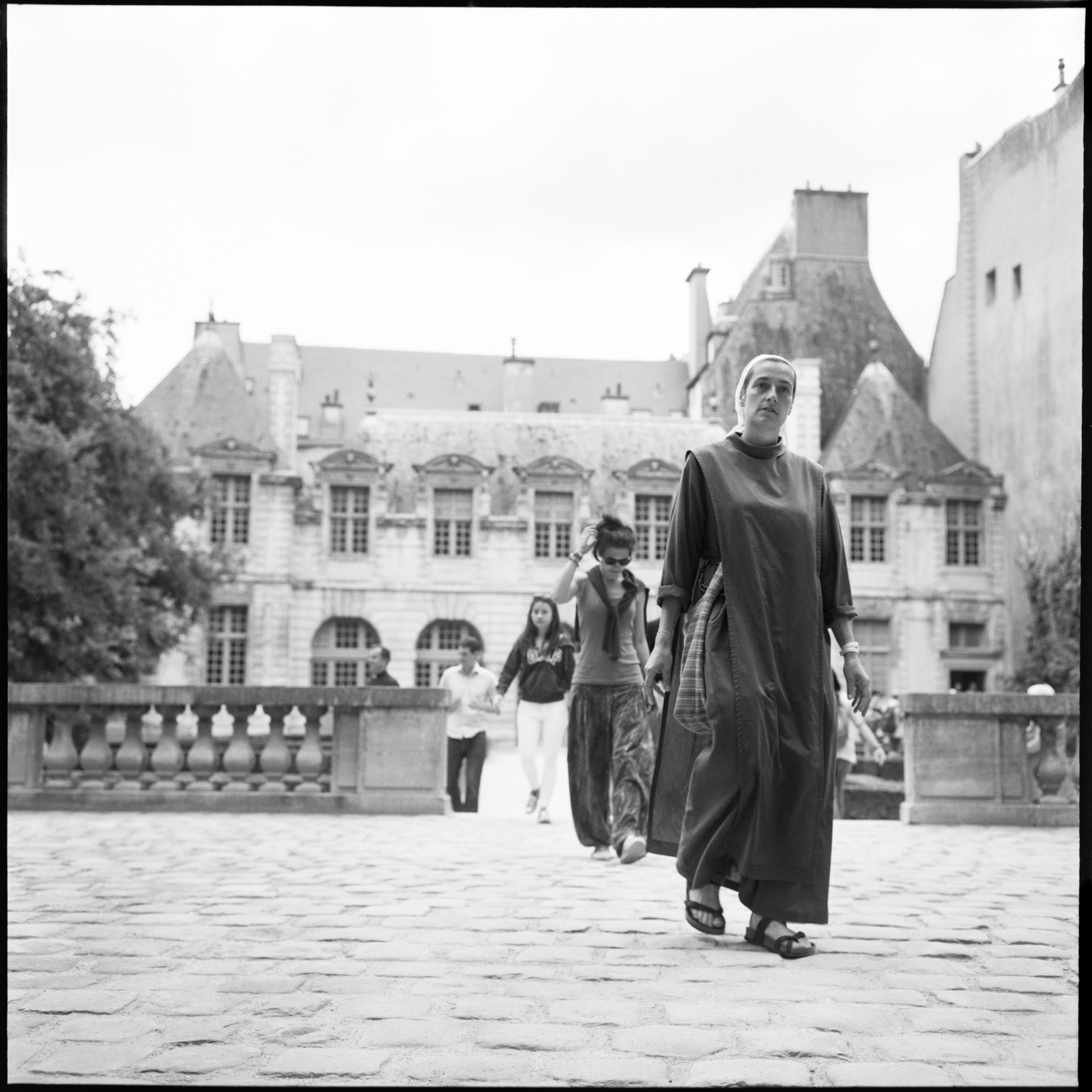
Visiting Paris is something I love a lot. I have been there many times now, and I feel no real urge anymore in visiting particular places or monuments, and I enjoy more and more just being there, and observing people, looking at things happening, or seeing things being just things.

Documenting with the old Rolleiflex helps me being a more attentive observer. Trying to shoot whatever presents itself is a challenge, but is also fun and maybe a bit contradictory, a very relaxing thing to me. It is a mixture of being an observer, and in a certain way being part of the city life.

Next to this, it is also a way to get socially engaged in a certain way. I get many conversations when shooting with this old camera, from people interested in what camera it is, how it works, if it is still able to find film etcetera etcetera. I try to go unnoticed, but that is difficult sometimes, and I don’t mind.

All shot on Rolleiflex 3.5 and Kodak TMax 400/100 film.

thank you for passing by.


Ludwig


New Publication – Goodlightmagazine

Nude, personal tips & tricks, Tips and Tricks

Goodlightmagazine, an online magazine specialised in photography lighting techniques has published an article by me about photographing nudes with available light. It contains a lot of examples, what to look for in a location, some basic rule explanations and very well crafted light diagrams.

make sure to check it out here:  http://www.goodlightmag.com/gift

just fill in your email address and you’ll be granted a free download of the current issue.

Personally I’m not very fond of the magazine layout, but the content is very good 😉

a sample of the first two pages of this 9 page editorial below:

best,

Ludwig

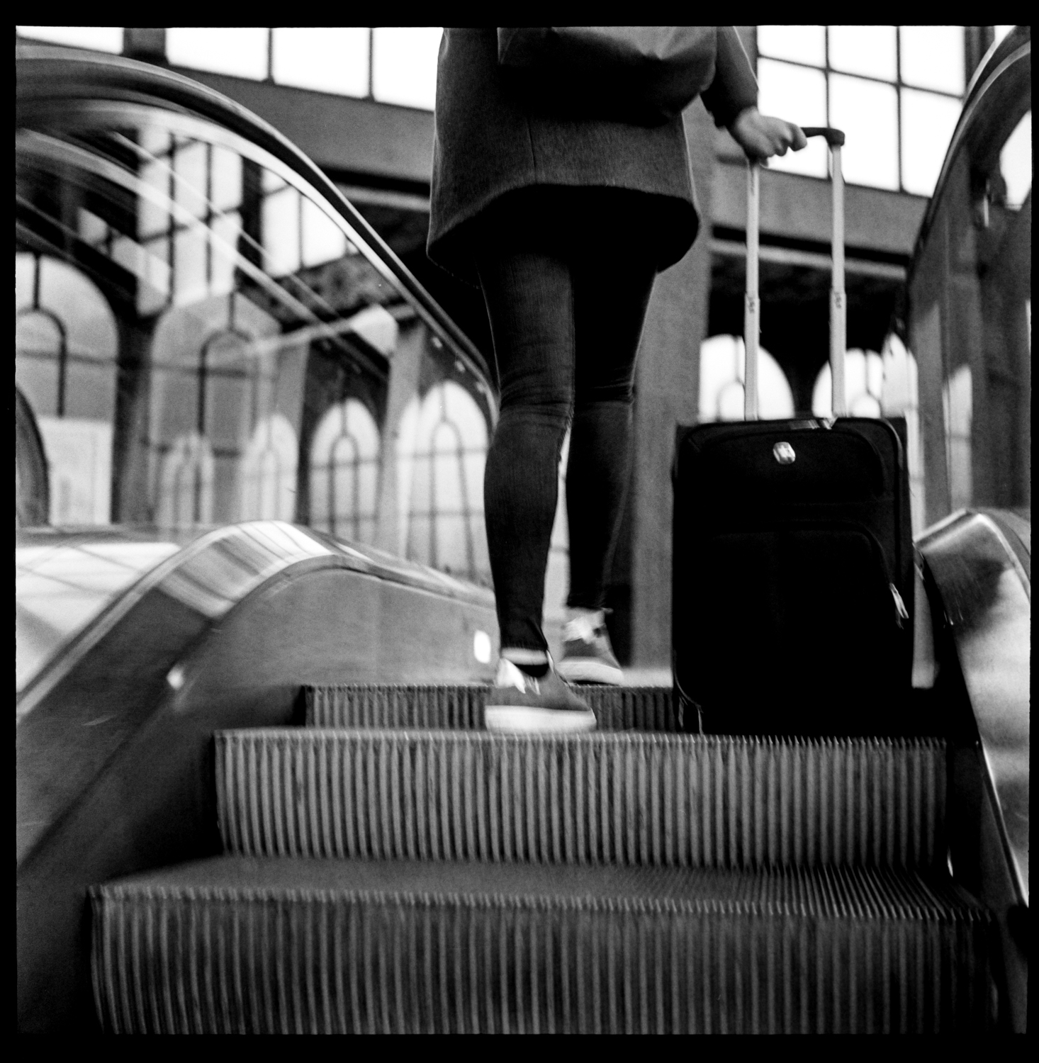
Strolling trough Antwerp with the Rolleiflex

Analog, street

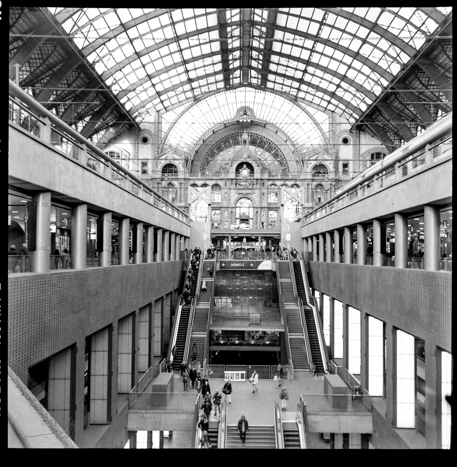
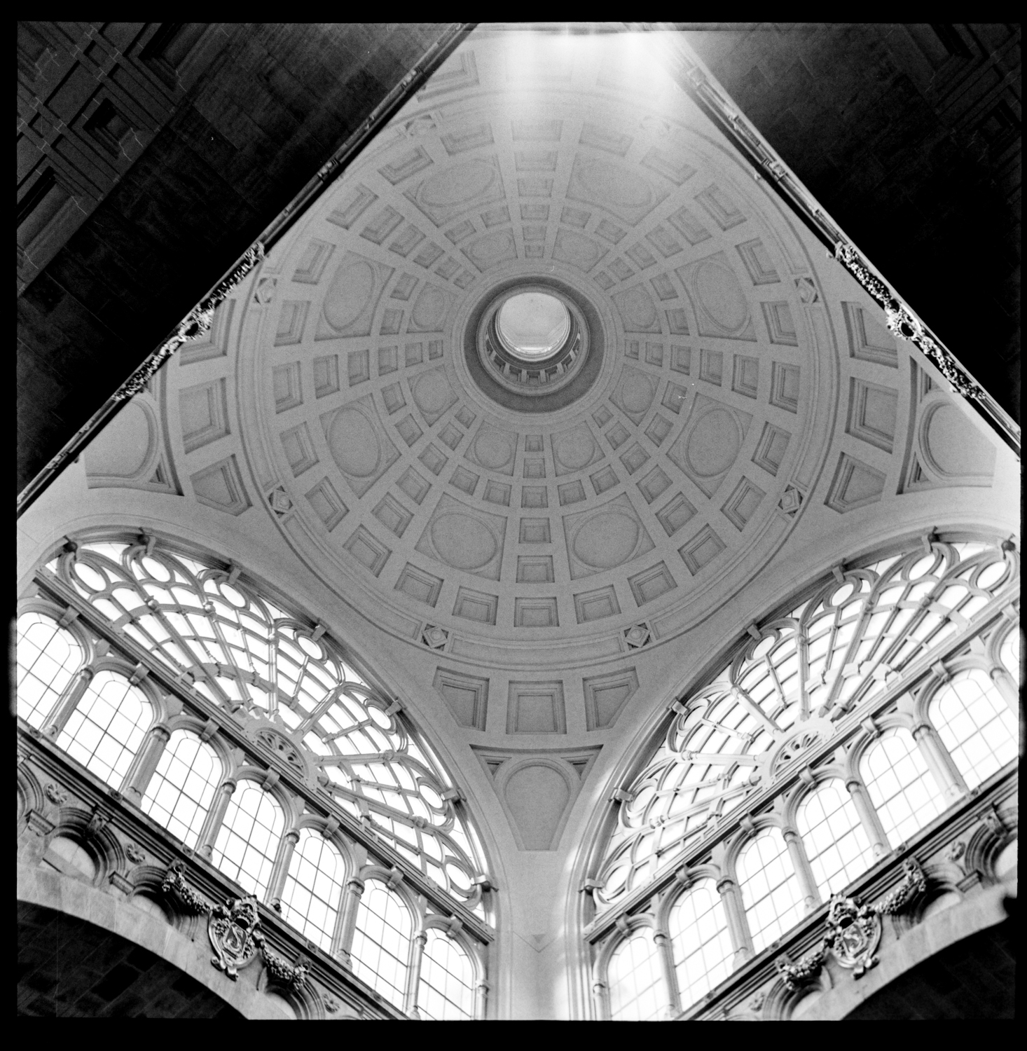
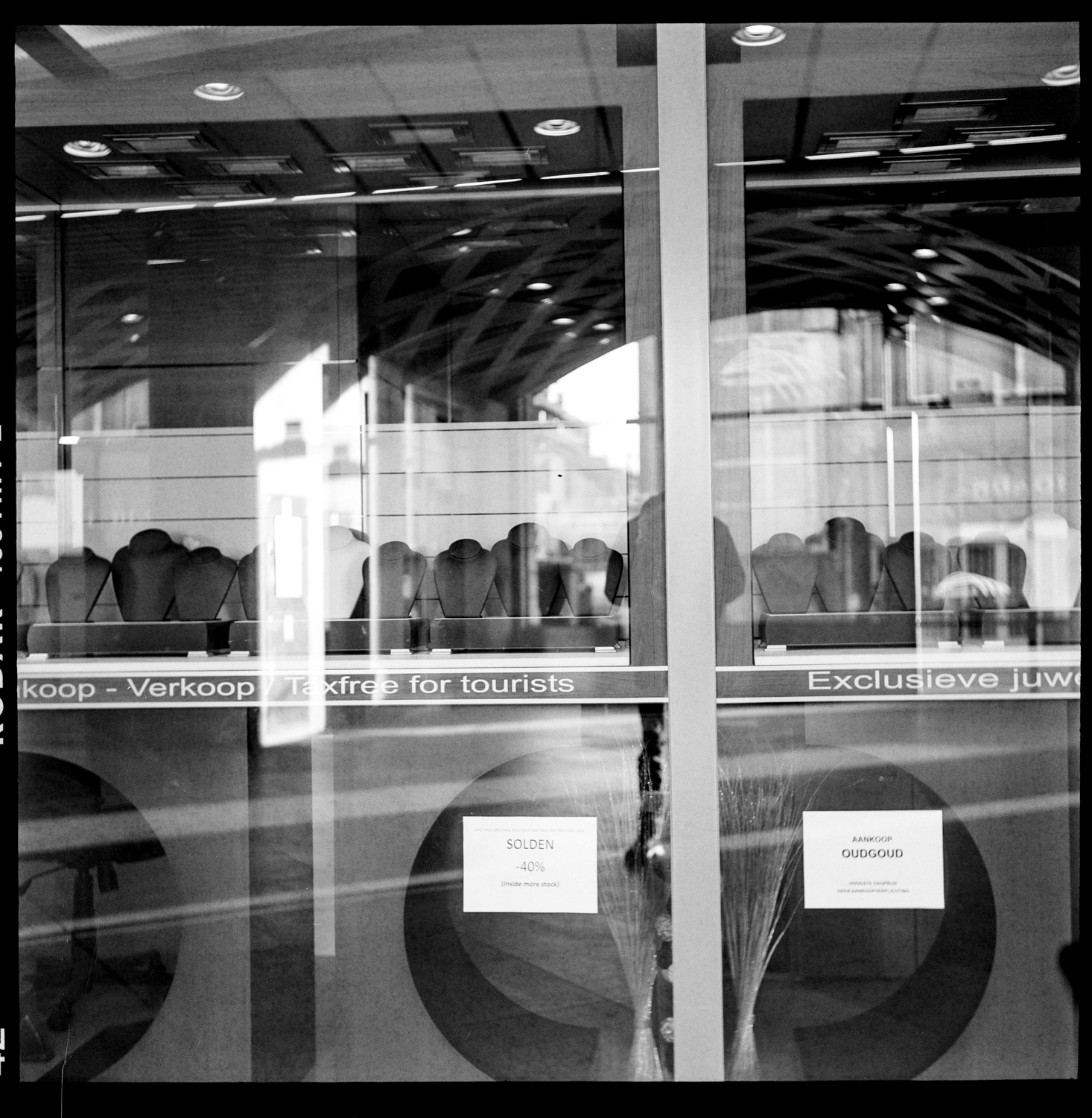
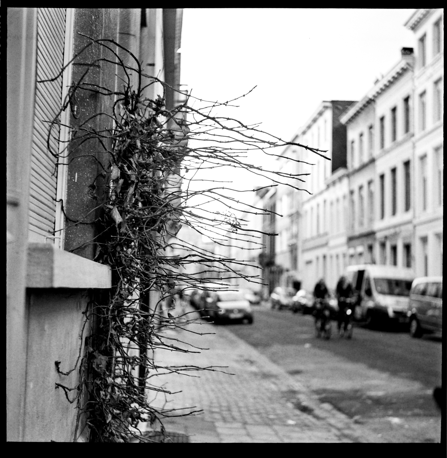
sometimes you find a roll of film you didn’t remember anymore taking it.

I found one a couple of weeks ago, in a corner of my desk … I had no clue of what was on it. I’m still missing a roll of Paris, (must have been lost in luggage somewhere) but this was not it. This is Antwerp. I remember having dropped of Nathalie for an appointment, near Antwerp train station, an ideal opportunity to shoot a roll of film with the Rolleiflex, just to learn to observe, have fun, enjoy slow shooting.

All shot on my Rolleiflex 3.5, with Kodak TMax400 film.

thank you for watching.

come again soon for some more Paris strolling with the Rolleiflex.

Ludwig

be sure to put your feet in the right place, then stand firm

beauty, erotic, Nude

… it is something I try to repeat to myself every day

the exhibit was good, a lot of people passed by to see it, despite the very good weather we had in these weeks. It was a pleasure to talk to so many people about photography in general, my work in particular. I have received compliments, appraisal and suggestions, they are all welcome. Still, doing what I do remains an investment in time, energy, money and other resources so I have to stand firm and not surrender.

the quote is by Abraham Lincoln.

• be sure to put your feet in the right place, then stand firm •

image details:

model: Elise

Make up: Heidi

Assistance: Nathalie

Photography: ludwig desmet

Canon 5Ds with Canon 135mm f2.0

1/125s f2.0 ISO 100


teddybear blues or … the story of self realisation

Analog, beauty, Behind the scenes Video, location, Tips and Tricks

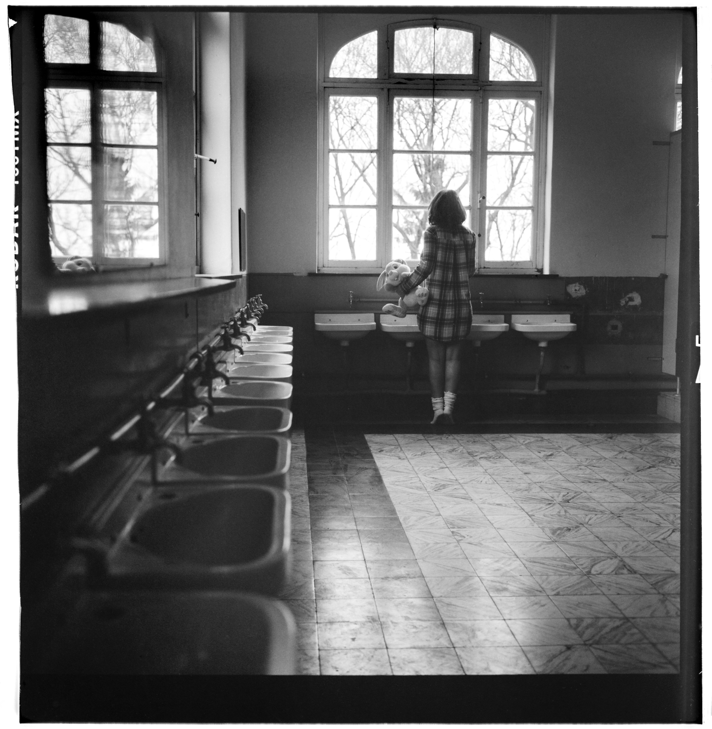
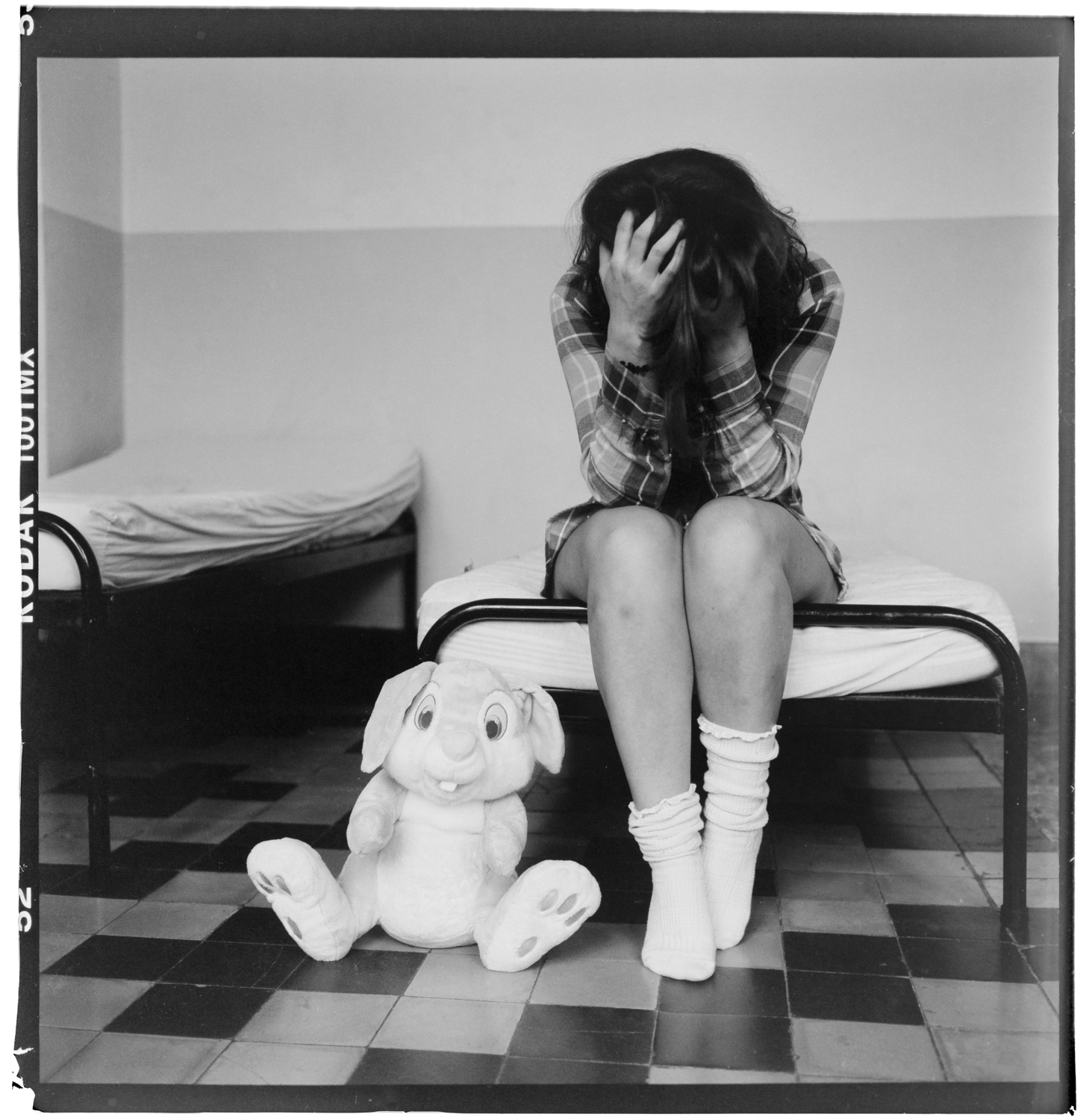
I shot this series of images in February, it took me some time to scan and develop the negatives, but here they are at last. I hope you like the story, I loved making it.

A big thank you to Rachel, for being a very patient model, on this cold and dull day. To Nathalie, for being my assistant, model hairdresser, camera-crew and guide. To Home Providentia, for giving me another opportunity to shoot at this unique location.

All images taken on Rolleiflex 3.5 camera with Kodak TMax100 and TMax400 film. Reproduced with a Canon 5Ds and Canon 100mm F2.8L IS macro, developed in Lightroom and Photoshop.


• teddybear blues or … the story of self realisation •


behind the scenes video of this shoot here: Shooting with the Rolleiflex

thank you for watching


ludwig


smashing the studio …

beauty, location, people, portrait

… to bits and pieces.

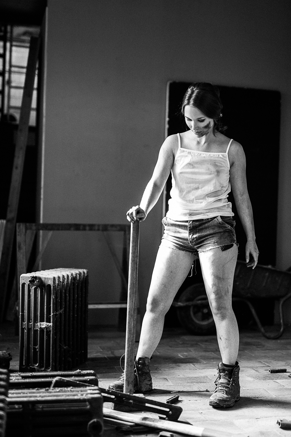
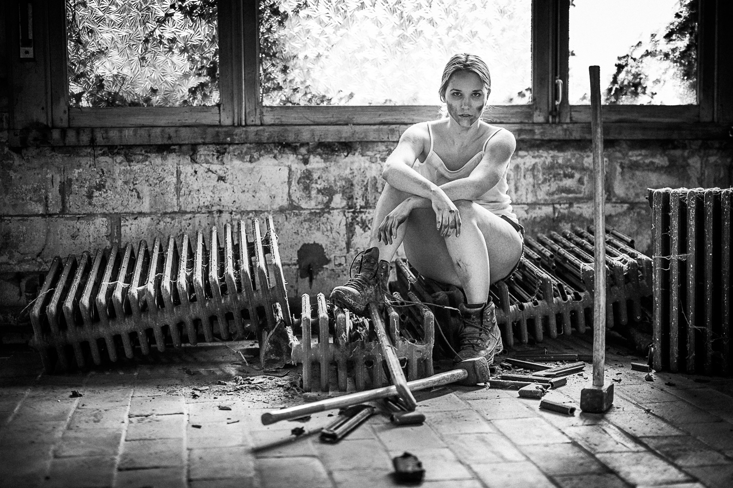
first time shoot in my home spot ‘studio in progress’ and after doing some fine art nude work I have put a big sledge hammer in the hands of the model. She did very well and acted convincingly. So much she even hurt herself as one of the metal pieces from the radiator punched her skin. Oops … Thanks for the help Charisse!

She loved it, and totally forgot about posing. 😉

• smashing the studio •

publication

Uncategorized

hi there,

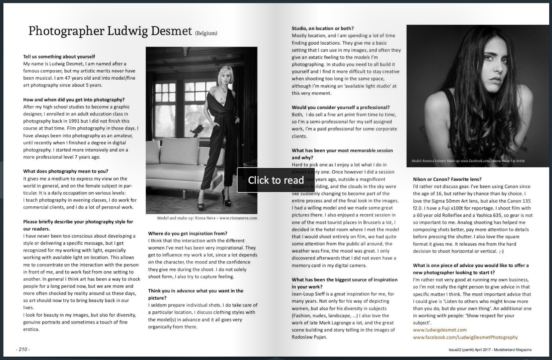
just a short message to let you know that I have been published with a short interview and a series of images in ‘modellenlandmagazine’. The magazine offers a platform for models, photographers, stylists and make up artists to showcase their work.

you can read, and especially watch the issue here:

http://www.modellenlandmagazine.com/issue22-4

my interview starts on page 210

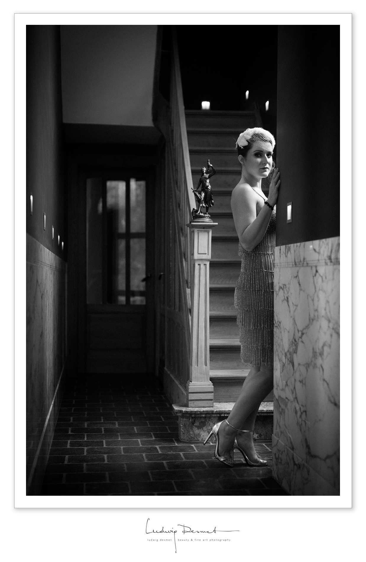
Charleston, for something a little different

beauty, location, personal tips & tricks, Tips and Tricks


it is always good to see that models bring their own ideas and clothing along on a shoot.

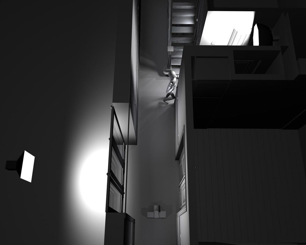
Next to being a source of variation and new ideas, it can also be a challenge do make something work that was not really in your mind-set when you started the shoot. We had shot early that afternoon in ‘the orphanage’, a huge former orphanage I guess, now rented as guesthouse for large groups. The weather was very dull and grey, and besides that it was raining and cold. Not really a nice environment to be in as a model. Rachel also brought some ‘Charleston inspired’ clothing and accessories, and we tried them out in my own home space. As there was very little light, and I wanted to create an evening atmosphere, I switched on the ambient lights in the hallway and staircase. These lights being very dim and not really at an ideal height for lighting a model. I rather not use flashes as they make the setup cumbersome and slow, but here I could not do otherwise, so I also installed two monobloc studioflashes. You clearly see the effect of one light (right of the model – 80cm octa) the other one is left of me, (60×60 softbox) in the room next to the hall way (there’s a triple entry door with glass inserts that filters the light softly into the hallway). The flashes are both at low power settings since I still wanted to use a rather wide aperture, for less depth of field. there’s a light setup at the bottom of this post.


the image is shot at 1/125s f2.0 ISO200. Canon 5Ds with Sigma 50mm Art. By using flashes I managed to dim the daylight even further, to an acceptable level that just keeps a small reminder of the structures in the window framework at the end of the hallway.


A big thank you to Rachel, for being my model on this day, and to Nathalie, my lovely assistant.


light setup:


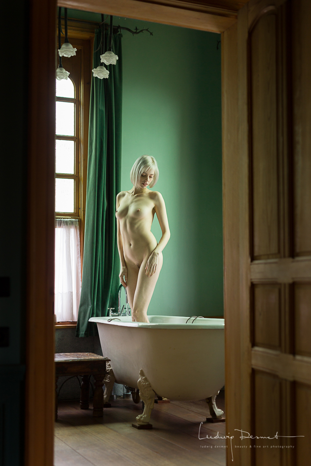
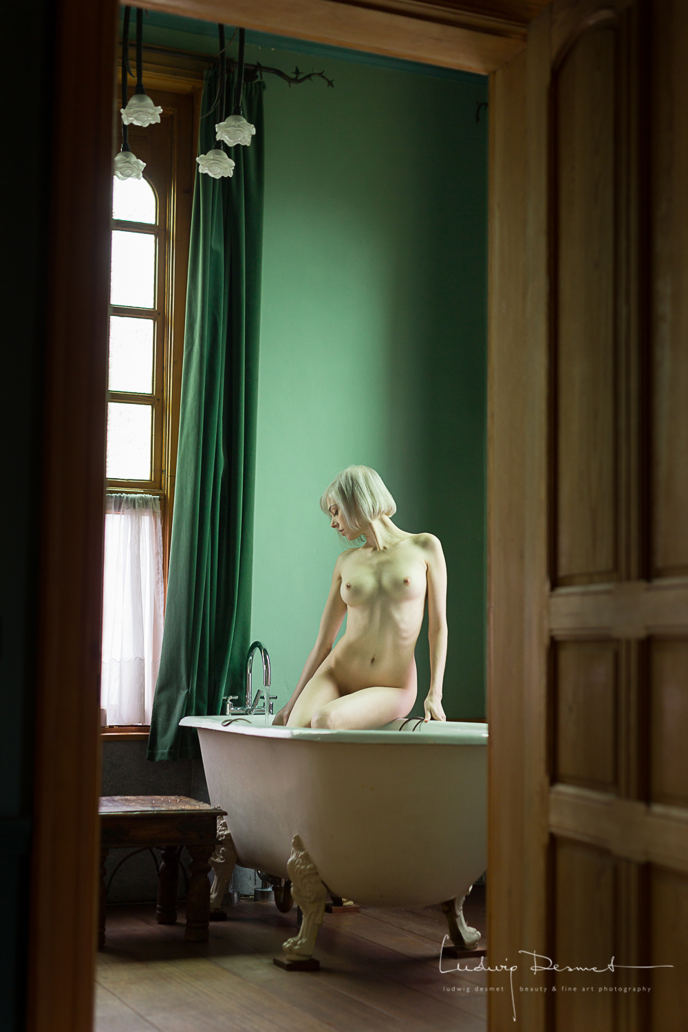
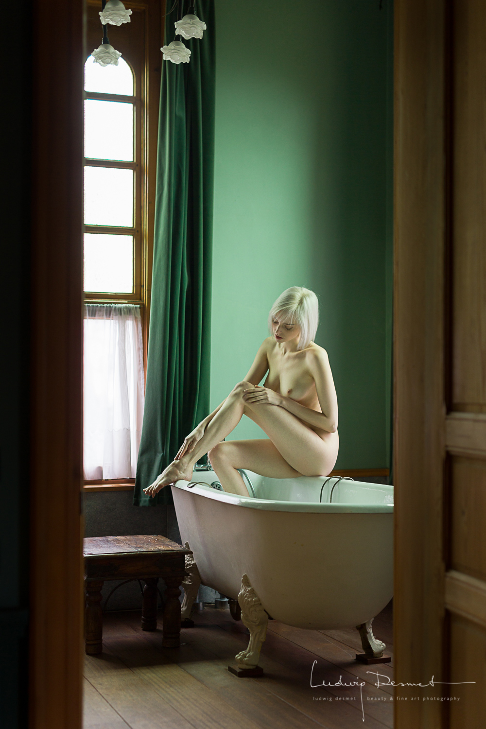
bathroom elegance

beauty, location, Nude, personal tips & tricks, Tips and Tricks

I had a hard time figuring out how to pose Riona in the bathroom, but once I decided to get her feet warm in the bathtub, things all became simple. See this link for a behind the scene’s movie from this shoot: BTS with Riona Neve.
Not only is Riona a charm to work with, she also has a wonderful figure, and we worked out some fine poses in this setting.
These are my favourites from this series, I hope you like them as well.

The light is not modified in any way, there’s the large visible window at the left side, there’s a similar window right from the bathtub. This semi-back light gives a very fine definition of the volumes on the body. The windows are tinted slightly green, I left the image colours to reflect that in the final developing. It matches well the green curtains and wall colour.

image settings below,

cheers,

ludwig


Canon 5Ds with Sigma 50mm f1.4 DG A

1/30s f2.0 ISO400 – beware of camera shake!!

… and then she started wondering …

beauty, location, Personal Pictures, personal tips & tricks, Tips and Tricks

… and then she started wondering, why she didn’t get these letters he promised to send her. Was he killed in battle? Had he forgotten about her, or probably he couldn’t find the time to write to her. These questions filled her with doubt and restlessness, even more because she was unable to reach to him …

Shot on a one-to-one workshop with Sacha Leyendecker in his available light studio.

Model and make up: Rubia Stri

Photography: me for sure.

shot on canon 5Ds with Sigma 50mm f1.4 DG A

settings for the main image: 1/80s f2.0 at ISO800

and then especially for Valentine’s day, complete series:


What I’ve learnt from the workshop:

Don’t be afraid to shoot at higher ISO settings if you need to to keep your shutter speeds safe. Play with light to create volume and atmosphere. Get some music into your studio to set a good mood. Create visual triangles in your images for dynamic compositions. Use props to create a setting and invite the viewer to imagine his/her way into the story.

What I didn’t agree on with Sacha (sorry Sacha, I think our styles are rather different, so the approach is different too): he told me to just have the model do whatever she likes to do, and what she feels comfortable with. I tend to interfere more with my model, and direct in certain ways (I also often work with non-professional models, maybe that’s why. Pro models are very much aware of what they look like, and how to move to get good shots).

I was very pleased with the results of the workshop. I was happy to meet Rubia, who is from Brussels by the way, and I had a very pleasant day for sure! Thank you Sacha, thank you Rubia!

thank you for watching.

Timeless beauty – exhibit – Larger than life

exhibition

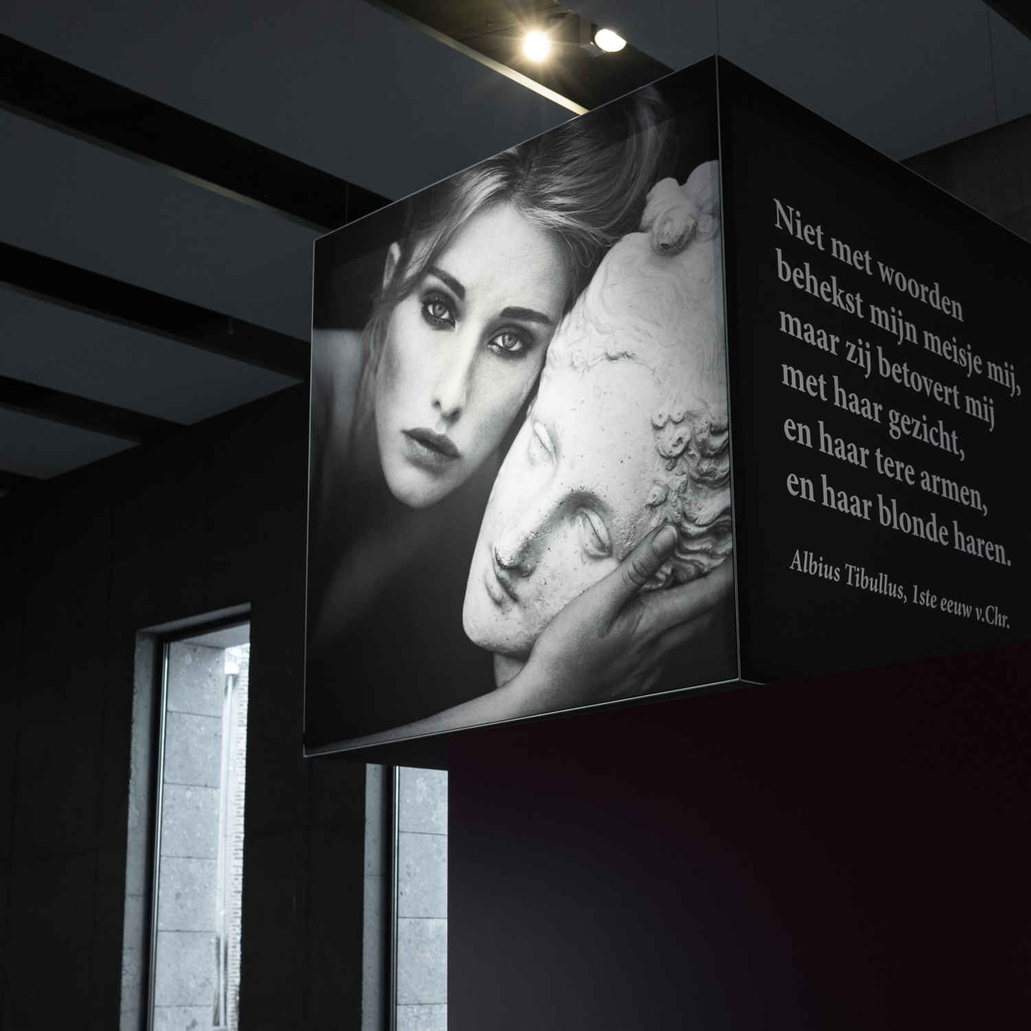
A couple of weeks ago I visited the exhibit Timeless beauty, in the Gallo-Romeins museum in Tongeren (Belgium). I visited it together with my wife Nathalie, I think a female look at things helps having a less biased view.

The exhibit combines antique (2000 years old) texts with images from the late Marc Lagrange, who  died last year, in an unfortunate accident with a golf cart. I have been a fan of a large portion of Marc Lagrange’s work for a longer period of time,  he has made a large collection of sensual images in which he depicts women as strong, independent, adorable, glorious creatures.

I would describe the exhibit as ‘Larger than life’ in several ways:

  1. The images are presented literally larger than life, impressive large scale prints, some filling an entire wall, where the image of the women becomes even more overwhelming. A total of about 50 images are used in this exhibit, mostly images that have previously been published in Marc Lagrange’s fine art books.

2. The images are all linked with old Roman and Greek texts, (Roughly 100 BC till AD 100) so carefully chosen you can hardly imagine that the text has not been used  as a direct guideline to create the image. Some texts are literally visualised in the image that comes with it. An amazing search for coincident content has been made here. This makes 2000 year old texts revive trough the visual work of Lagrange.

3. All images have been linked to archeological findings related to the subject of beauty, to the deliberate actions of early age women to modify their looks for the sake of beauty. Both visualised trough objects, but also in video format, in which the techniques at hand at that era are demonstrated.

4. A selection of interviews of day to day women is giving a broader contemporary view on physical beauty. How it influences our lives today, how it is perceived, how women (and men) strive (or not) to achieve it, how decisions of medical/surgical manner are considered (or not) to be valuable, desirable in the pursuit to beauty … interesting hearing, straight from the heart of the people talking.

It shows that beauty standards are not just from our modern times, but that it has been present for a very long period. I have found it very interesting also to see how beauty was also very clearly age related, with a shift from pure physical beauty at a younger age, towards a more mature, innate beauty from a certain age.

As the subject of feminine beauty is often present in my work, I have enjoyed my visit a lot. It is wider oriented than just the male vision on female beauty and that is a good thing. It has a selection of images by Marc Lagrange that I love a lot. (I’m not very fond of his latest, more staged work).

And the best thing, you can still visit it, till june 30th 2017.

More info: Timeless Beauty

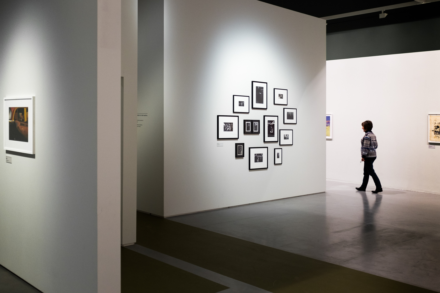
Saul Leiter – Retrospective – Antwerp Fomu 28.10.16 – 29.01.17

exhibition, Uncategorized

one thing to start with, I’m very sorry this exhibit is over. I have really enjoyed it (again on one of the very last days of the exhibit – I tend to postpone exhibition visits till the moment I can’t  any further delay it or I’ll mis it) so there’s no way you can see it here in Belgium anymore, sorry for that.

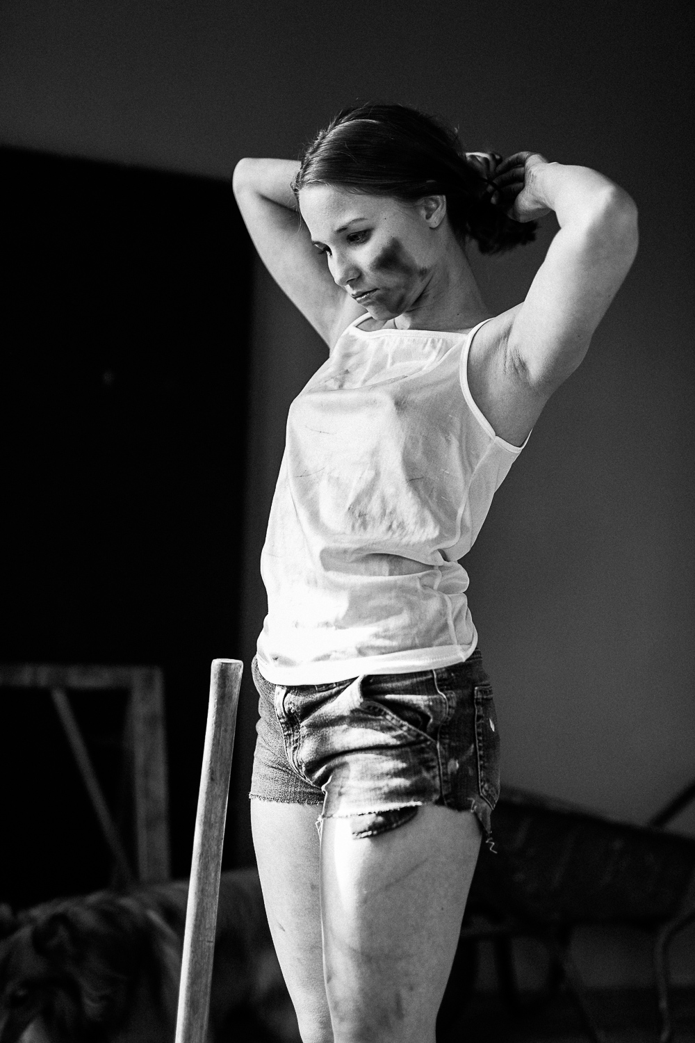
I have enjoyed the exhibit very much. It gave an overview of Saul Leiters’ work both commercial and non commercial, presented in the humble way that Leiter proves to be in the documentary movie (In no great hurry – 2012) that was made of him shortly before he died in 2013. Small paintings, small prints, and a vast number of images. I kind of missed a clear structure in the exhibit, but that might be purposely related to his way of working, and his total disorder in his huge archive.

Over a period of about 60 years he documented street life in the south-east part of New York, in a very particular way. He had moved into New York mainly to start as a painter, and this approach is clearly visible in his work. Deconstructed impressionist frames form the setting of a lot of his photographs, in which often a single person is the only immediately recognizable feature of the image. Often there is no figurative element at all, and all is fuzzy or blurred and an impressionist vision on the city life is all that’s left. Remarkably colorful, even in winter settings, he manages to make his images a delight to look at. Often the content of his images is captured between several layers of reflections, mirrored images, damp-dripping glass surfaces where you have to work your way around as a viewer.
Saul has become famous only after a very long period of working, and it seems he never fully realized the quality and the impact of his work. In this perspective I would gladly recommend viewing the full documentary ‘In no great hurry – 13 lessons in life with Saul Leiter’ as it offers an in depth encounter and it is a testimony to humility and unpretentiousness I have seldom seen in an artist of this scale. Inspirational at least.

You can see an extensive selection of his work here:

Howard Greenberg Gallery

another source of info:

https://www.artsy.net/artist/saul-leiter

thanks for reading,

ludwig