Since september this year I started giving Lightroom 4 classes. I have a group of 18 students, and they manage quite well.
Although there’s quite a lot to learn, most people with a normal level of intelligence, and some motivation and a basic knowledge of computer usage must be able to learn all the techniques available for developing in Lightroom.
The biggest problem however is to get a feeling about what decisions to make when developing. Actually what steps to take to improve an image.
Without claiming that I can give you a perfect example of a perfectly developed image, I would like to show just an example of a image development I did just recently.
I chose to turn it into a black and white image, and used some tinted processing. This is all very individual, and you should always adapt to your personal choice. That’s why this is the most difficult thing to learn I guess. It’s by no means an exact science.
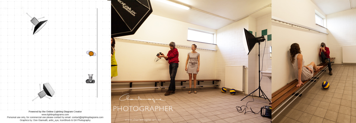
First of all maybe a small light setup diagram, to show you how this image was lit.
Left you see the light diagram. I have two monoblock heads with soft boxes headed straight at my model. (one octa and one smaller square box) They are about equally powered, both on the lowest setting to allow for a large aperture setting. EXIF: ISO 100 – Canon 85 mm f1.8 at f4.0, 1/125 sec. Canon 5D II.
You can see two behind the scene’s pictures from my friend Michel. In the middle You see me metering light at the approx spot where my model will be, and at the right you see me working with the model. -Click for bigger image-

I have fairly evenly lit images with this setup, with the white wall bouncing back a lot of light to the shadow side of my model.
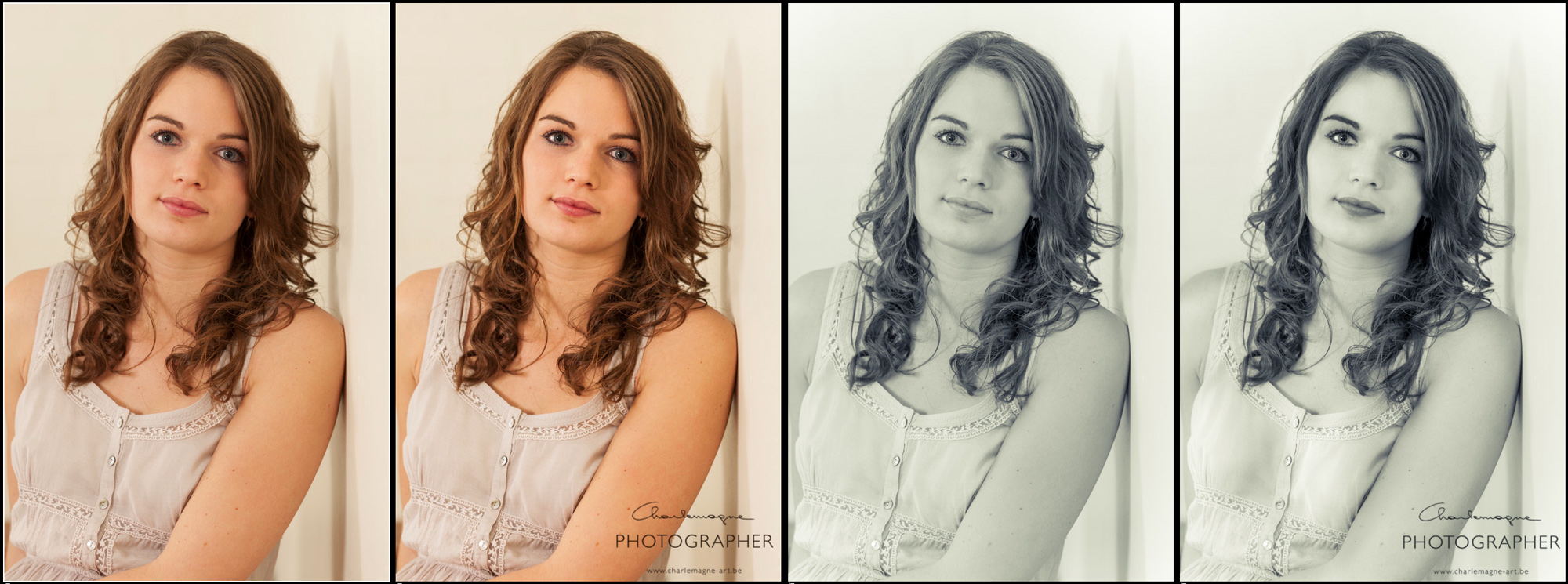
Next image shows the four stages of development:
Left: straight out of camera, no development settings applied in LR.
2nd: just some basic overall adjustments
3rd: Conversion to BW and split toning applied
last: final, local corrections applied
-Click for bigger image-

Some more into the details:
2nd image corrections:
I adjusted white balance to 5500 (5D II chooses 5600 for flash)
Added some contrast +20 to give some more punch to the overall image
Shadows +26 to brighten up the shadow side of the model
Clarity +15 I feel like using clarity slightly makes the details stand out more
that’s all
3rd image corrections:
I rather bluntly converted this image to black and whit by dragging all saturation sliders in the HSL to 0.
Furthermore I experimented with the split toning colors and came to this setting: Highlights hue 67 – saturation 24 – balance 0 – Shadows hue 235 – saturation 19
This gave me a rather flat (for the skin) black and white – toned image.
The Split toning (or cross processing) is a good feature, but is often used to create a wow effect on an otherwise not so interesting image. Beware of it’s use!
About the black and white conversion, the image could have converted with some more lightness in the oranges, to lighten up the skin, but I did it afterwards with local brushing.
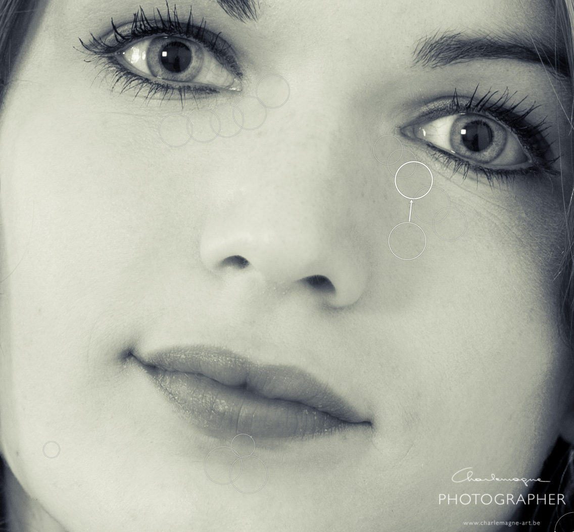
In between these, I applied some local retouches to the face, to remove some blemishes and imperfections. I worked around the eye and just under the lips. Far from correct, but just a quick edit.
Settings: Heal, with an opacity of 66

and then for the final corrections. I have used different brushes, and will show them all stripped apart. Here are the brushed images for each of the corrections. Sometimes I have to search for myself what is the best setting, so some brushes may undo some previous ones. Unfortunately you don’t see the image change, since I have all effects applied on every image. This is just to show you the different area each brush is applied to: -Click for bigger image-

then from left to right, what did I apply in my brushes (local adjustment tool):
1. Exposure 0,41 – Shadows -30 A rather bluntly applied overall skin enlightenment, also applied to the hair, but there I took some away again after.
2. Exposure -0,71 – Added some extra volume to the arms and face.
3. Exposure -0,27 – Contrast 54 to give some additional punch to the facial features. (eyebrows, eyelashes and lips)
4. Exposure -0,53 To accentuate some volume in the female shapes (I’m not into plastic surgery, but this is something I sometimes do)
5. Exposure 0,70 Idem
6. Exposure 0,26 To highlight the iris a little bit
7. Exposure 0,71 To soften the eye rings
8. Exposure 0,61 To clear up the eye whites a bit.
I’ll leave it up to you if this is a better image than the one I started with. Again, this is to each and everyones personal taste. Most of my images I don’t process that much, and this took me some 5 minutes all together.
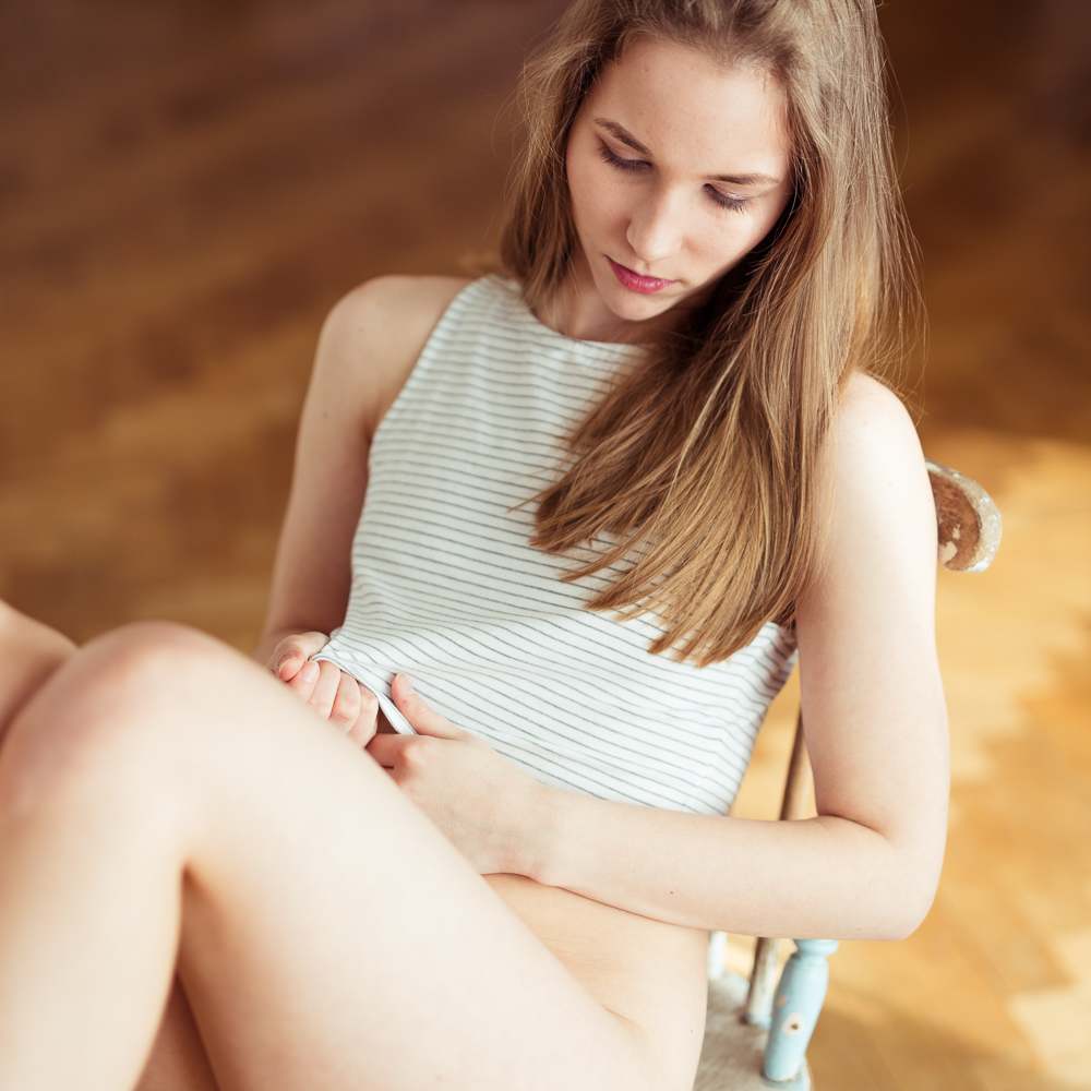
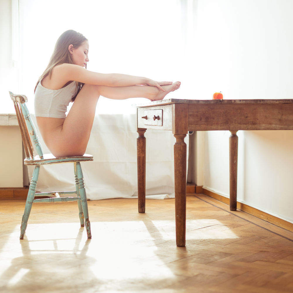
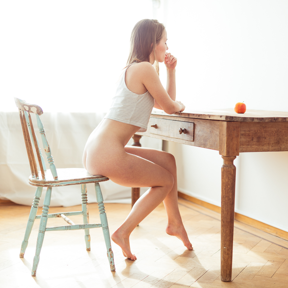
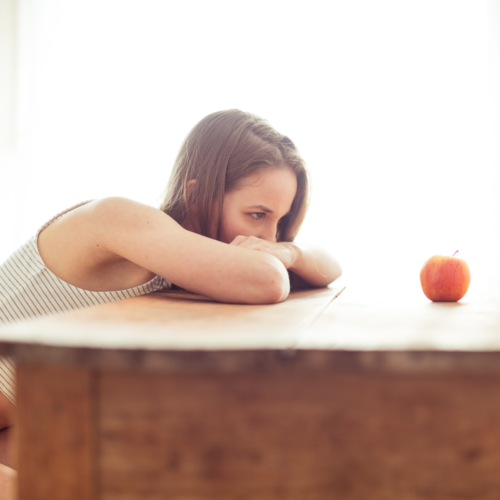
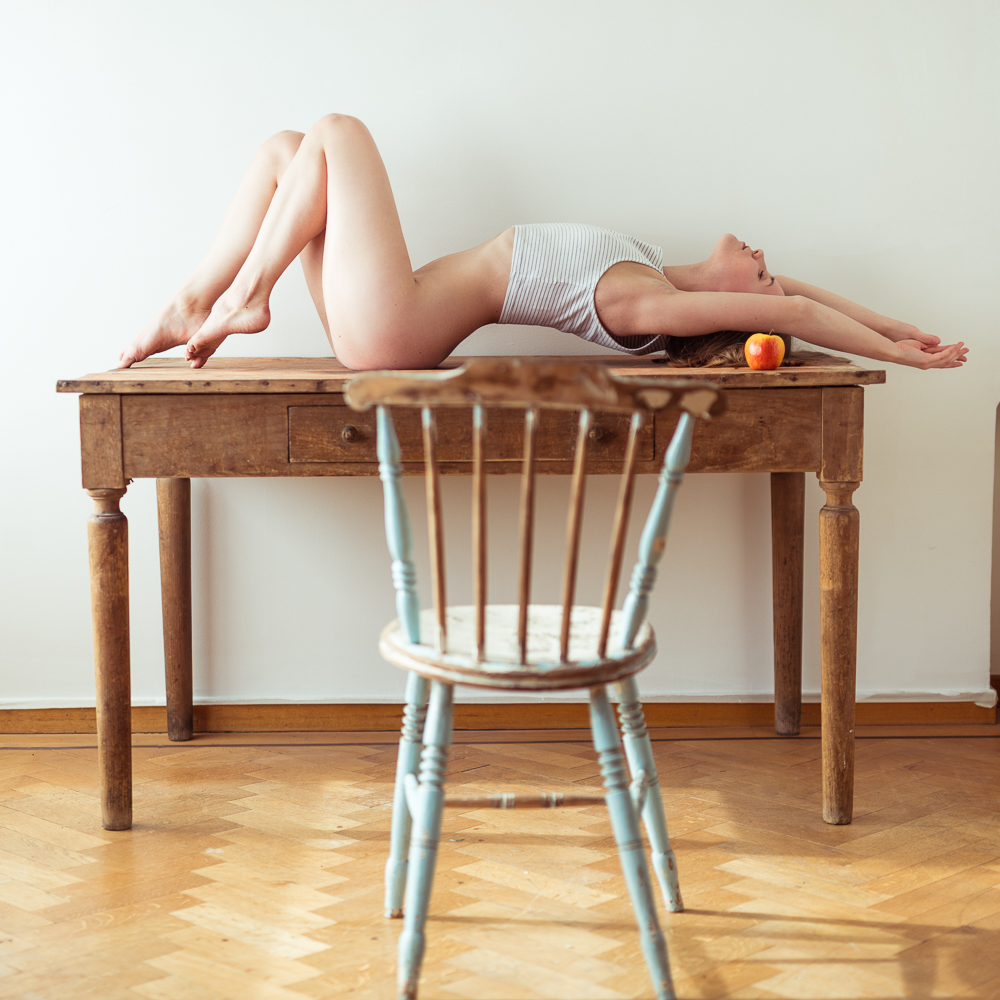
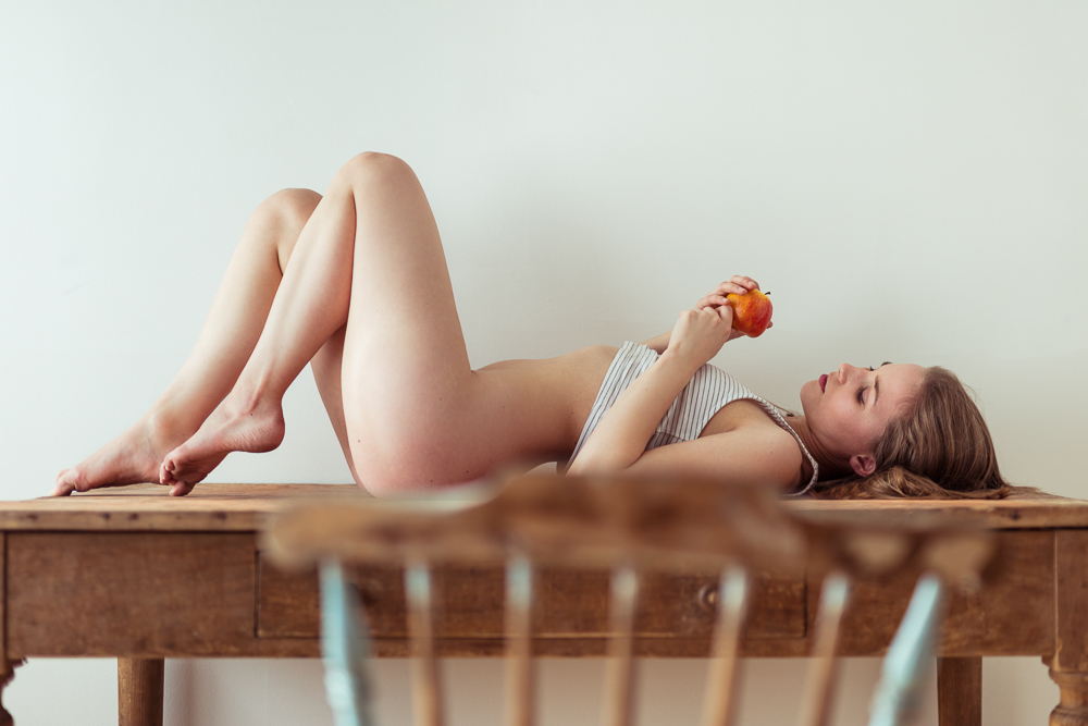
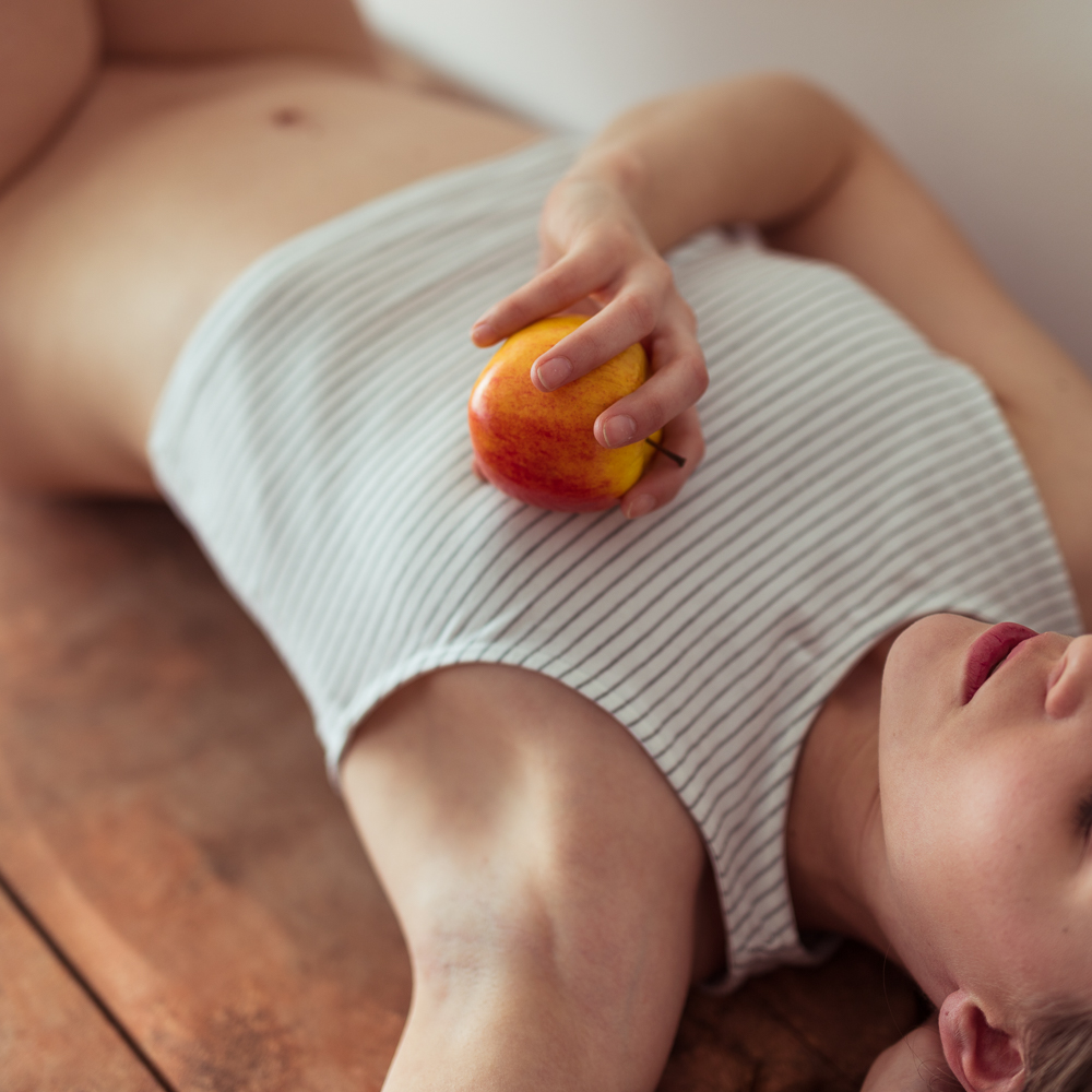
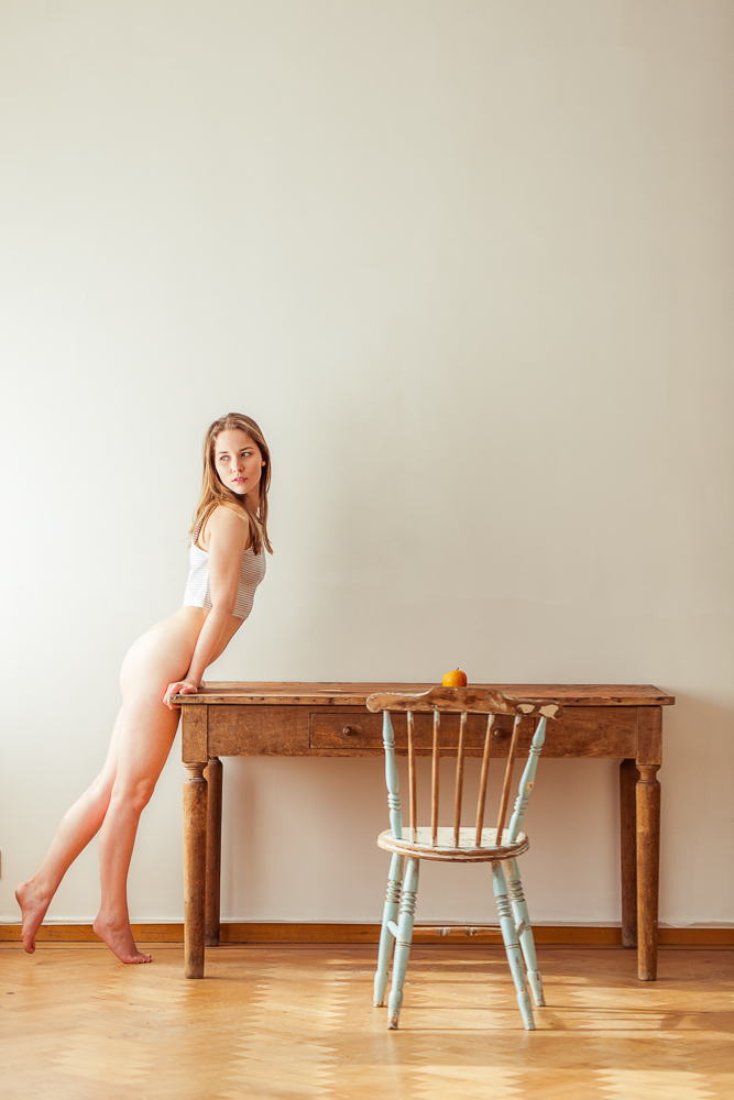
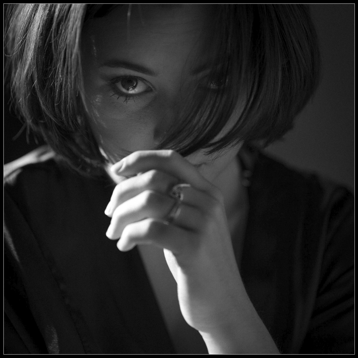
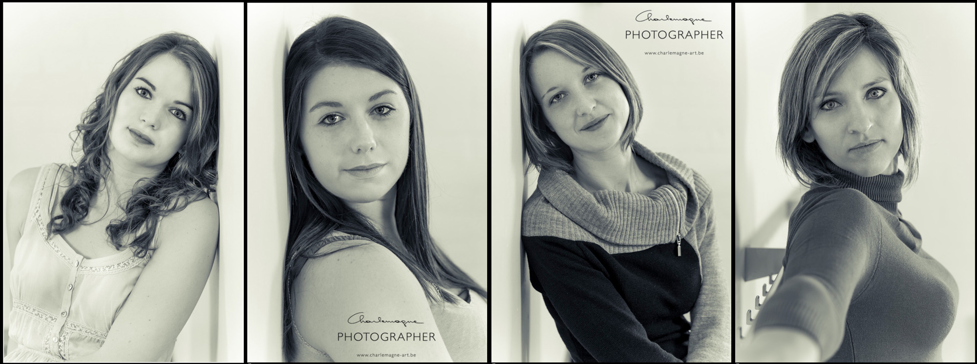
Finally some more images from the same shoot, processed in the same way. -Click for bigger image-

Thank you for reading, come again soon!
Ludwig – alias Charlemagne –


