One of the often overlooked features of Lightroom is the camera calibration tab.
Camera calibration optimises the way Lightroom will interpret the RAW files of your specific camera. It reorganises the colour values in relation to a pre-defined target, and the way your camera reproduces this target.
In very short, RAW files do not have a colour profile embedded, nor do they contain a predefined color reproduction definition. It is up to your raw-editor to interpret the raw files and do some kind of a pre-development when importing and previewing on screen.
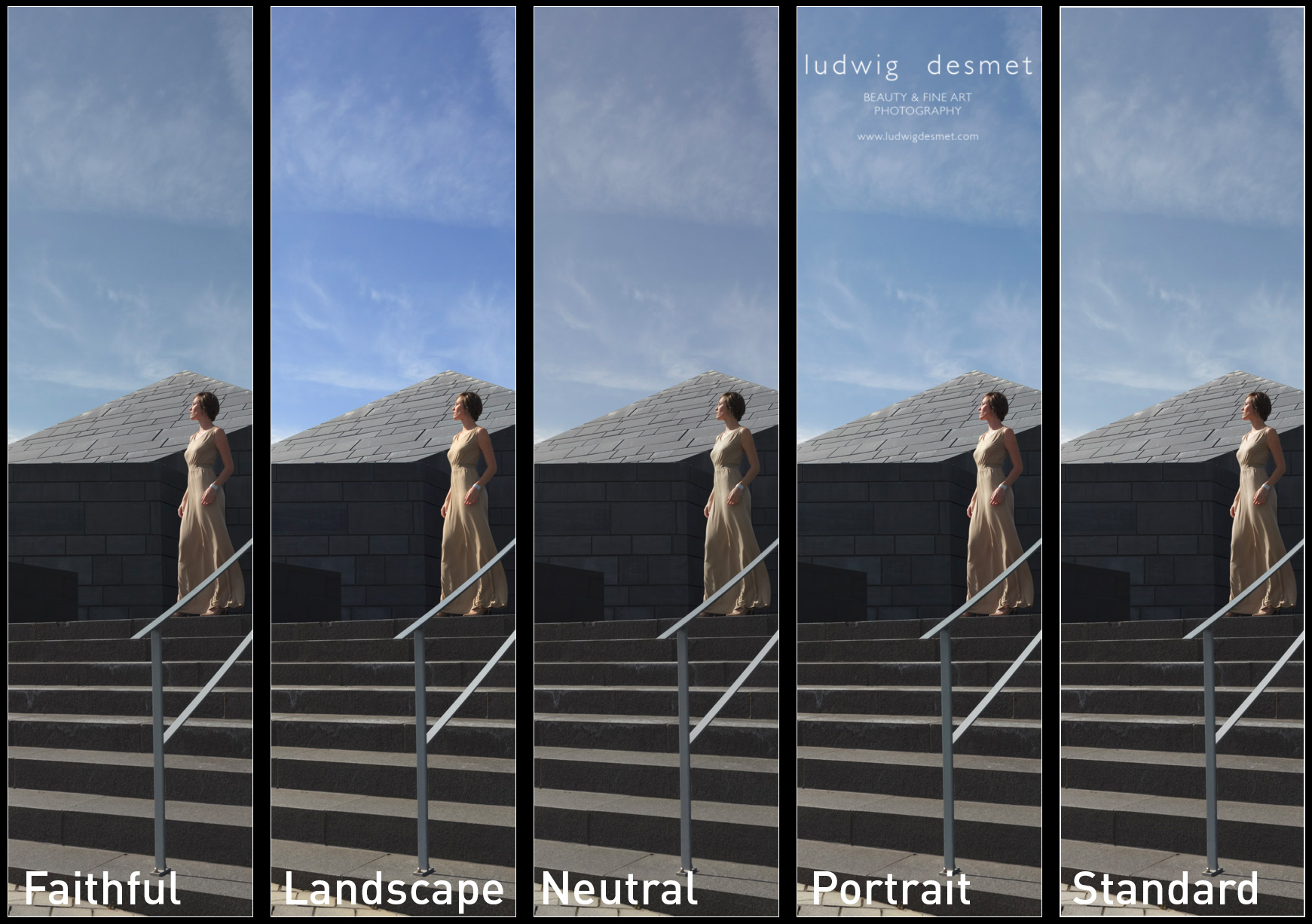
Current Lightroom versions use the ‘Adobe Standard’, or one of the options also available in your camera image settings modes (with Canon, this is for instance: Camera faithful, landscape, portrait, standard, … )
This is no guarantee for a correct reproduction of colours or brightness values.
In comes the camera calibration tool. I have the colorchecker passport photo from X-rite. This is a combination of a small piece of hardware (a plastic booklet with 2 screen printed colour target sides and a white face) and a piece of software to be installed on your system.
The simplest way of doing a camera calibration is a single light situation calibration, in which you take a picture in the light situation you will use for your images, including the colorchecker target. Take care the target is lit by the same light as your images that follow.
After that, shoot your images.
In Lightroom, you will need the first image with the target included to make build your camera profile. This is very simple by selecting the image -> export -> Colorchecker passport. This will automatically compare your camera’s ‘target reproduction’ with the target’s known values in the software, and build a ‘custom camera profile’ for you to start with. The new profile won’t show up until restart of Lightroom. (there are certainly more detailed step by step explanations on Youtube 😉 )
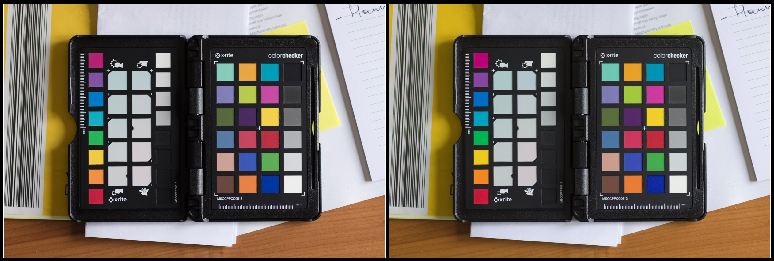
Below you can see the target without and with the newly activated camera calibration.

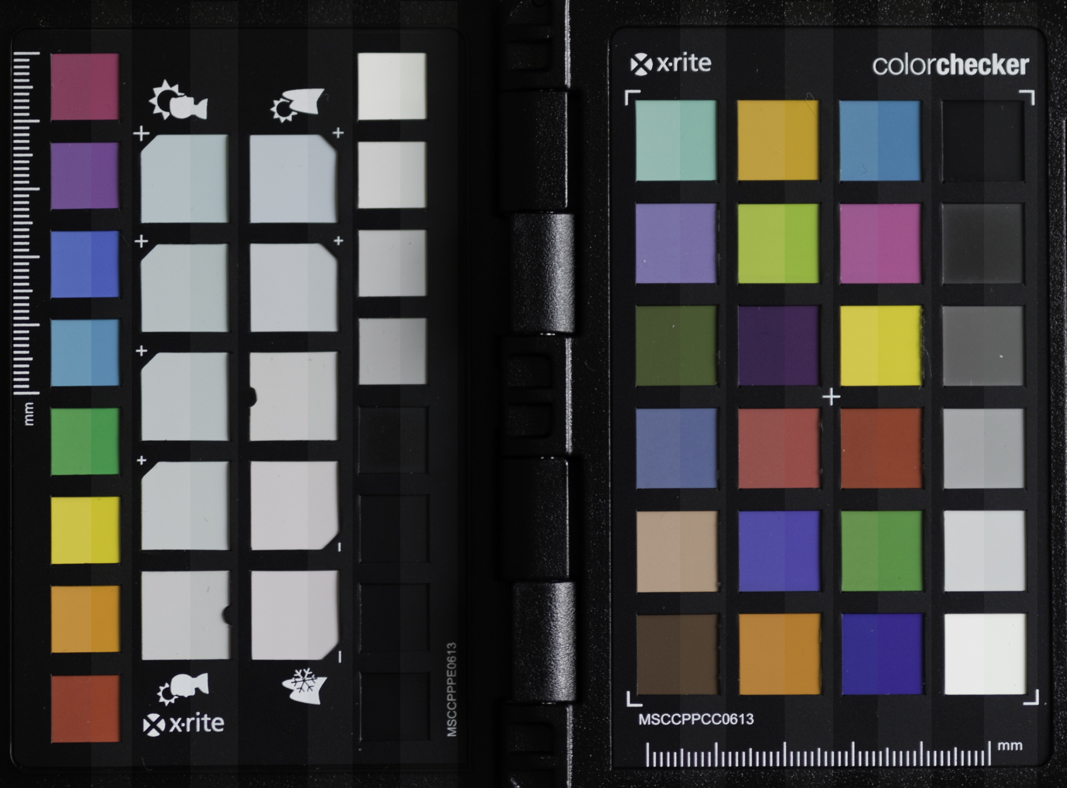
not a big deal you’ll probably say, and this camera is indeed rather color-correct compared to some others I’ve seen. To make things more obvious, I placed both images onto each other, and made a layer mask to cover up half of the targets:

left half with ‘Adobe Standard’, right with my custom color profile on the Canon 5Ds.
Colours are more saturated, some a tad lighter, others a little darker, some colours shift slightly, (note the purple and the yellow-green on the right) but especially the blacks are less deep. This is especially helpful if you need to uplight the dark tones (shadows) in LR.
These are two versions of the same RAW file, but they get different RGB values. This means that the initial state of your raw file is very much dependent of your Camera calibration settings. If you are very fond of let’s say the ‘camera portrait’ picture style settings on your camera, then you might as well use this profile in your RAW-editor. (as photographing in RAW will not edit the data in your images, but the preview on the camera’s back is based on a jpg file modified by the settings in your camera. your preview will still get the ‘camera portrait’ picture style view, but your RAW will not reflect it.
That is why an image might look good when importing in LR, and then switch to something dull a second later. The initial look is from the embedded preview file, generated by your camera, the second look is from the preview generated by LR, based on the camera calibration settings currently active (standard setting = Adobe Standard)
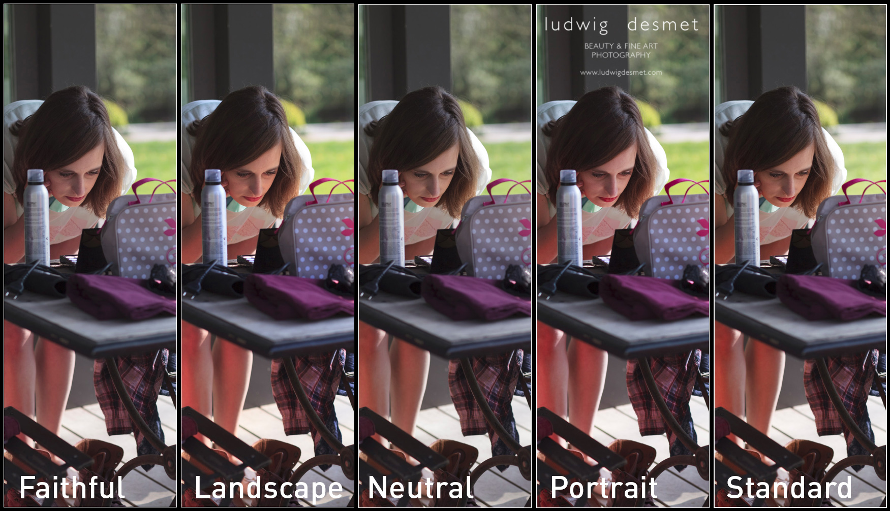
If you want to experiment with camera calibration without buying the tools needed, try using the ‘picture style calibration settings’ available in the drop down menu. They should reflect the ones you have available on your camera. The differences should be obvious.
Below two examples of different ‘picture style camera calibration’ settings. Note the changing skin tones in the first image, the changing sky colour in the second.


The process version is the way LR interprets RAW files since earlier versions, you should currently use the 2012 version. (July 2016)
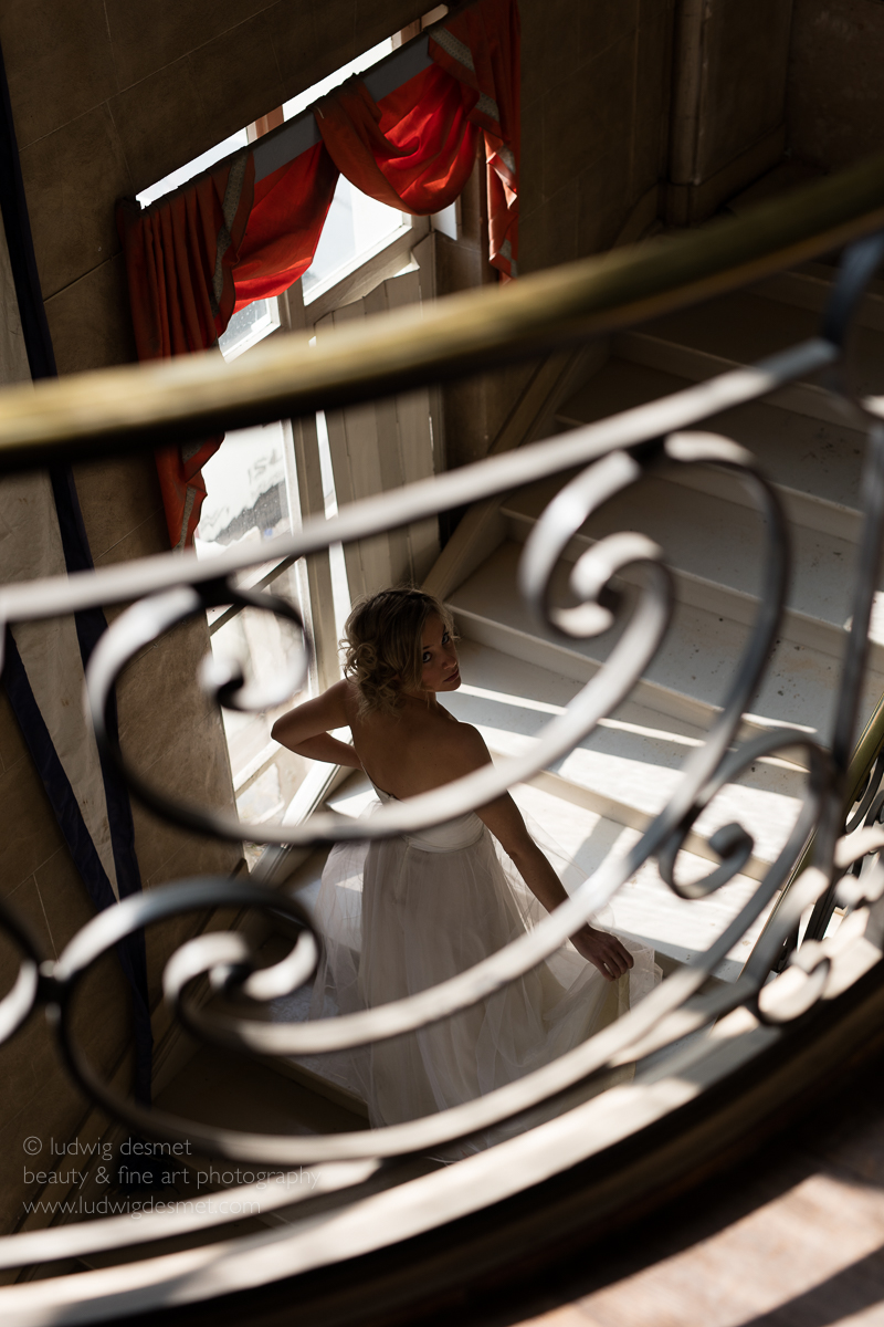
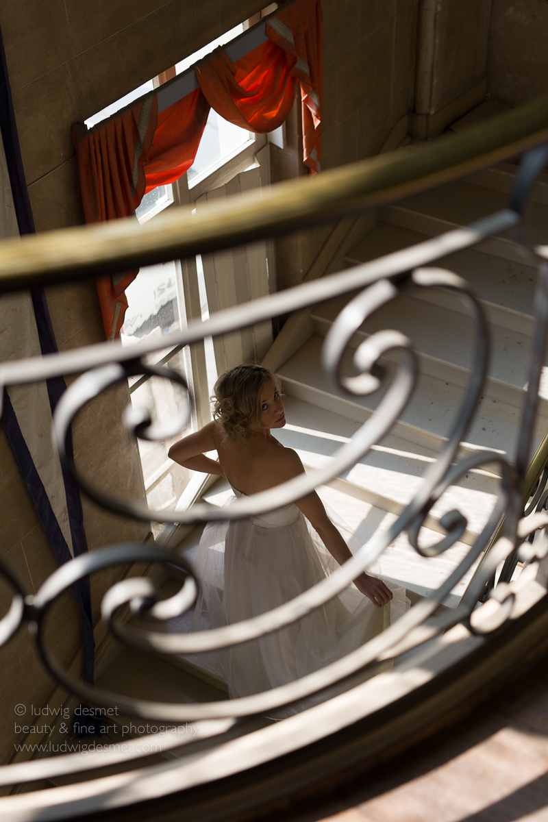
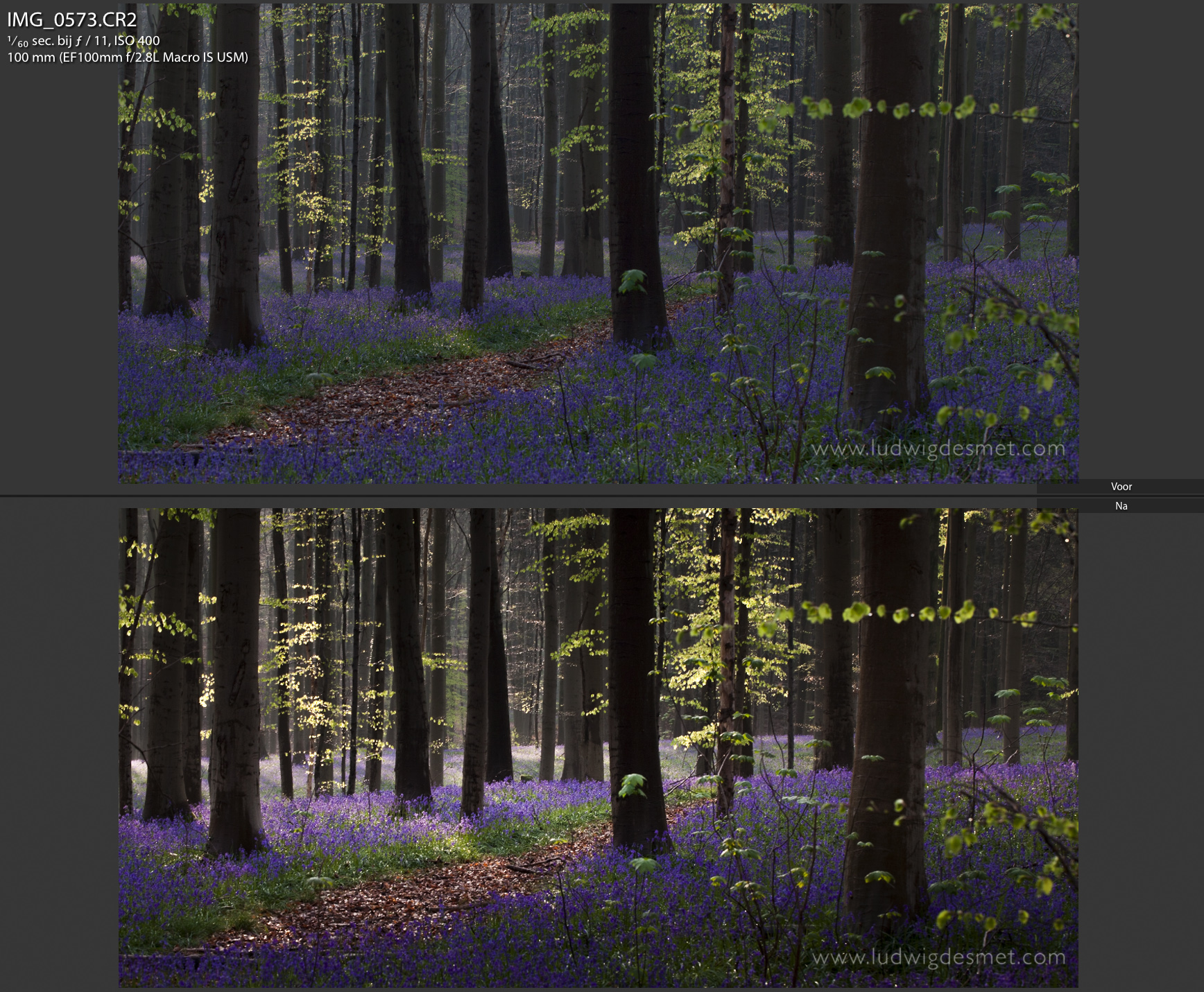
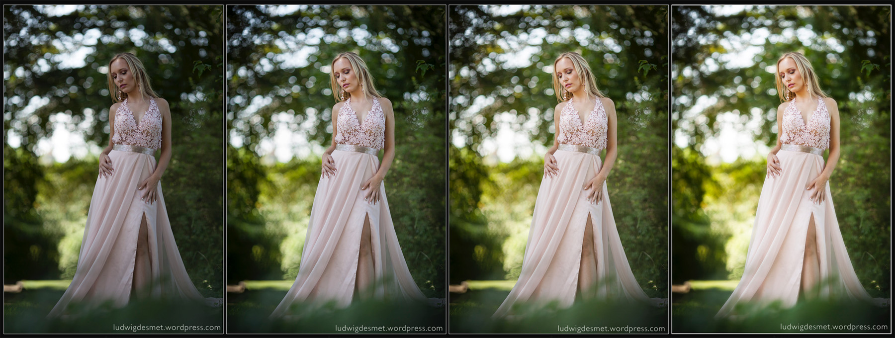
To give a real world example, first image with ‘Adobe Standard’ profile, second with Custom made profile:


I think that the shaded area’s are very obviously lighter in the second picture, with the correct camera calibration profile. These are unedited images. For me this lighting situation is very common, high contrast, backlit situations, where you want to make sure that the highlights are not blown out (clipped). As you know I seldom use extra light on a shoot (except for a reflector from time to time. In this way I absolutely need to be able to enhance my shadow area’s to a descent light level. This less dark starting situation is of a lot of help.
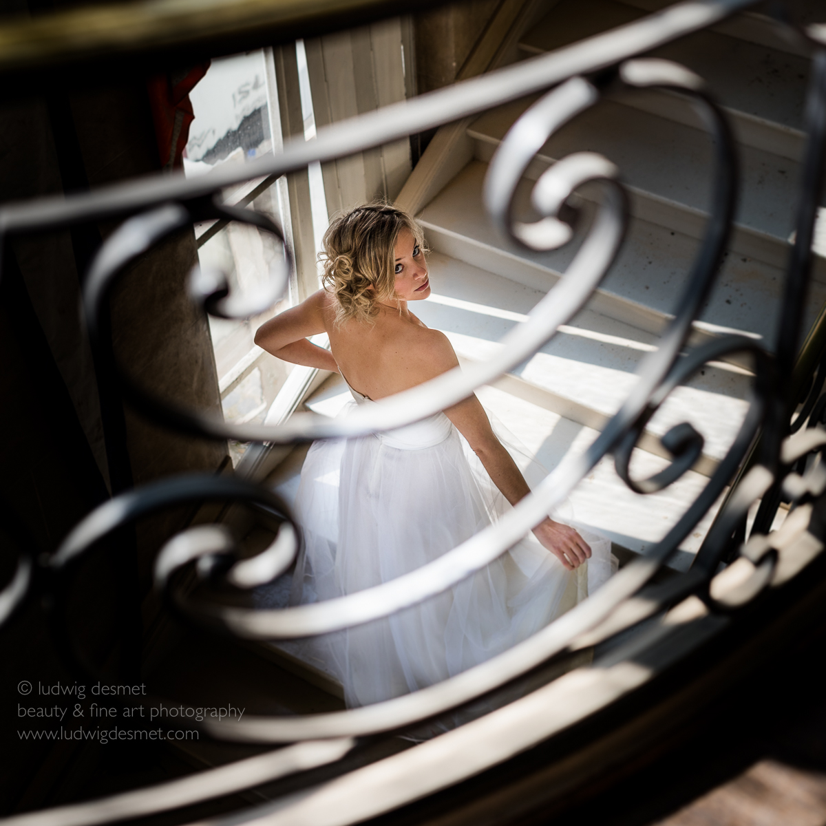
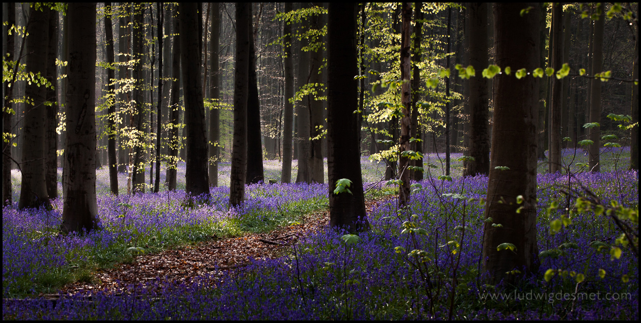
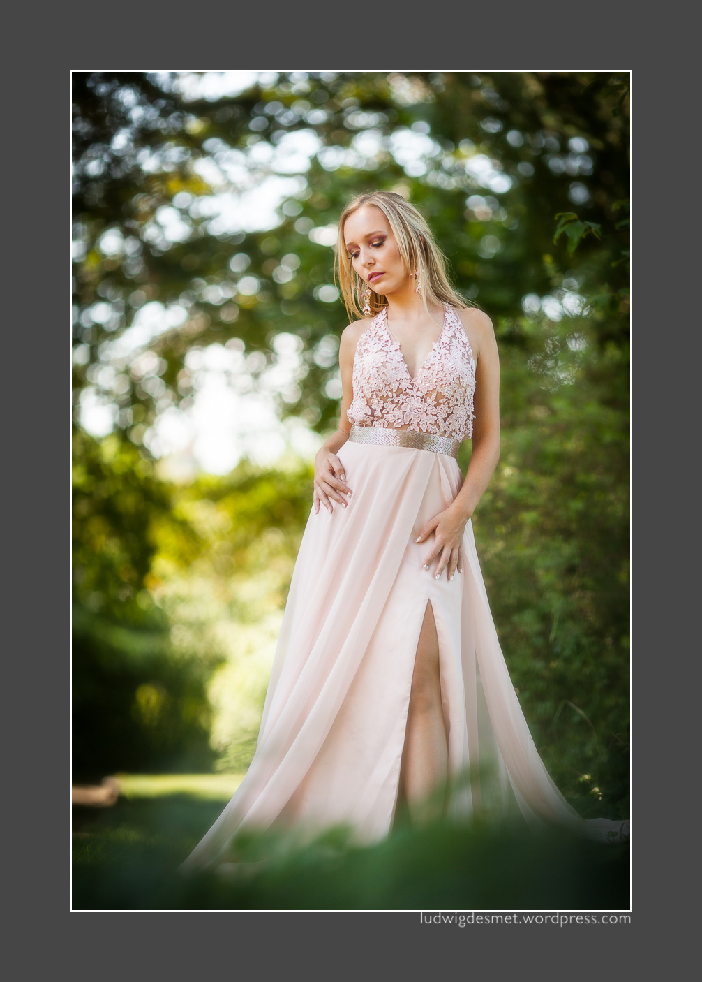
The edit looks like this (same editing on both images) Adobe Standard above, 5Ds profile below. In the first image, the colours are slightly red, but especially the corner shadows completely run black (due to my vignette, I know). Compare with the corners in the second image, where I can keep plenty of detail, with the same amount of vignetting.


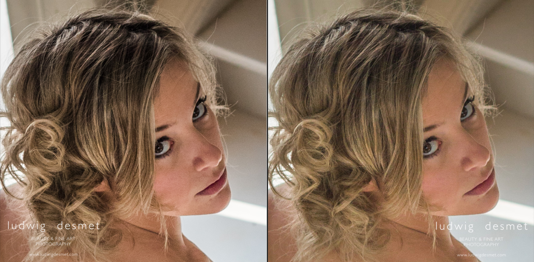
When looking in detail, you’ll see that I keep a lot more detail in the hair, and I have less noise appearing in the second image. (upping the shadows a lot also emphasises image noise)

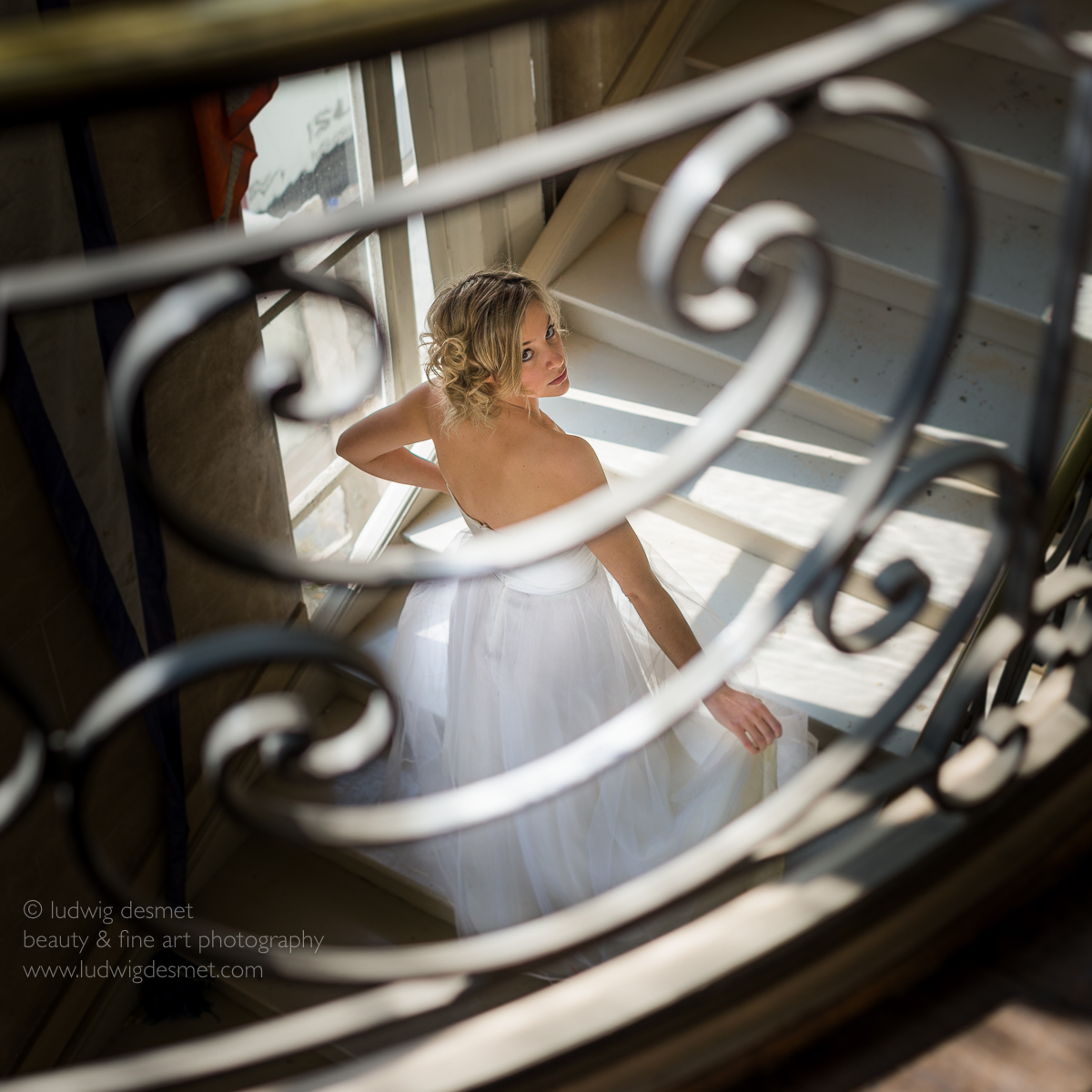
Image: Jenn at Baudries Castle
Hair: Nathalie
Make up: Heidi
I think Jenn has a large amount of ‘Nathalie-Portman-looks’ here 😉
Canon 5Ds with Sigma 50mm f1.4 DG A – 1/640s f2.8 ISO 160
see you soon for part two of this explanation, and for a lot more images:
summer time, shooting time
ludwig


