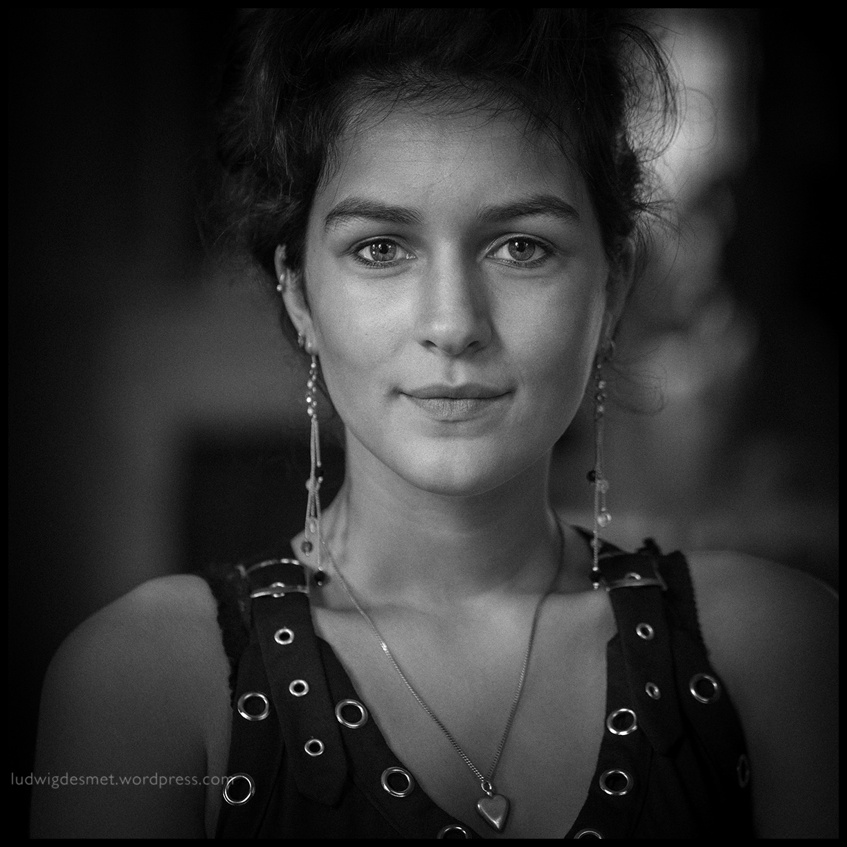
Hi, I have been looking for a different WordPress template that gave a little more appreciation to my pictures. This new template leaves the entire width available for pictures now, I think it looks a lot better. If you miss the previously available – archive – subscribe – latest writings and other options, they are now on the bottom of each page, hidden under the + triangle. Please enjoy this natural light portrait of this beautiful lady below and let me know what you think about the new look of this blog. 🙂
Kimberley

Ik denk inderdaad dat dit meer de aandacht naar de foto’s brengt.
Less is more
Looks great and even better then before. Thanks for posting your highly appreciated work.
This is a welcomed improvement, Ludwig, Your work is most certainly worthy of a larger presentation!
Cal
On my laptop screen need to narrow the browser window to see the full hight of the picture.